
CHI FOREST | VISUAL BRANDING
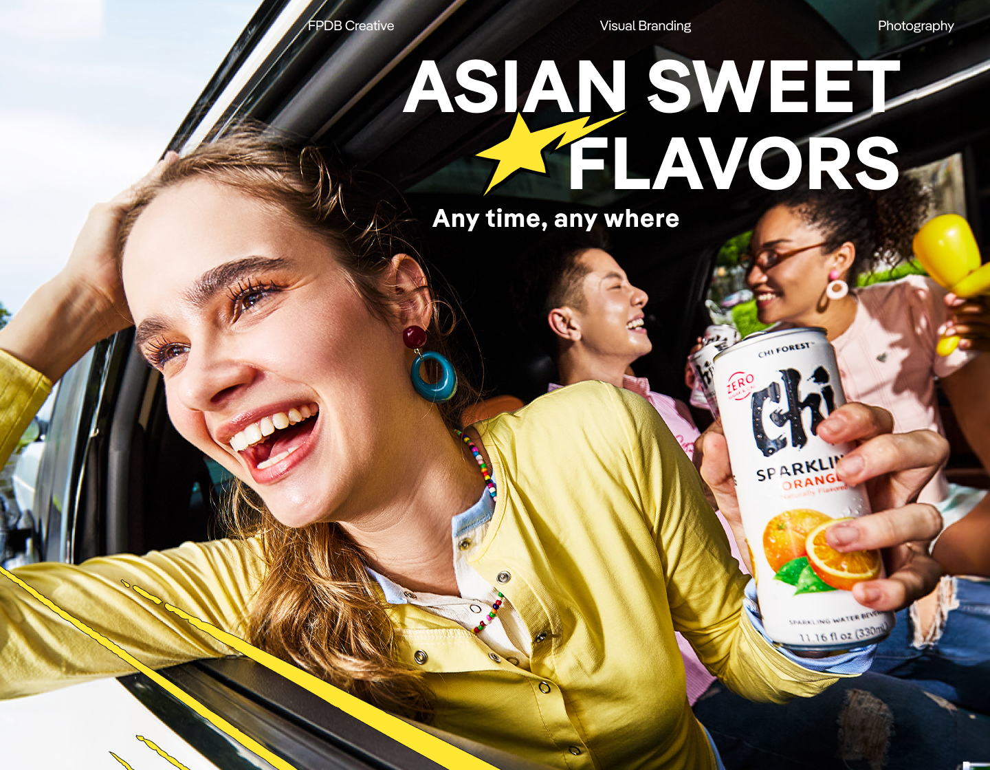
About The Project
Chi Forest is a sparkling refreshment brand with Asian-inspired flavors and a light, modern product spirit. For this project,
FPDB Creative developed a visual branding system that helps the brand show up more consistently and expressively across different touchpoints.
The project focuses on shaping a visual world that feels refreshing, flavorful, youthful, and easy to recognize.
-
Our Menu
Research
Creative
Strategy & Idea
Visual Branding
Creative Direction
Graphic DesignnConsultant
Visual Pillars
Visual Cues
Art Direction
Production
Look
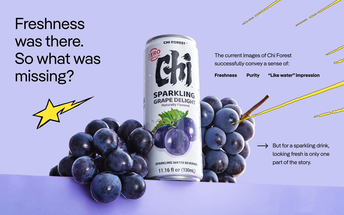
Before shaping the visual direction, FPDB Creative looked into Chi Forest’s product, audience, market context, and current visual impression.
The research pointed to a clear opportunity: to bring Chi Forest closer to Gen Z lifestyles, not just as a product on shelf, but as a refreshment brand
that could appear naturally in different everyday contexts.
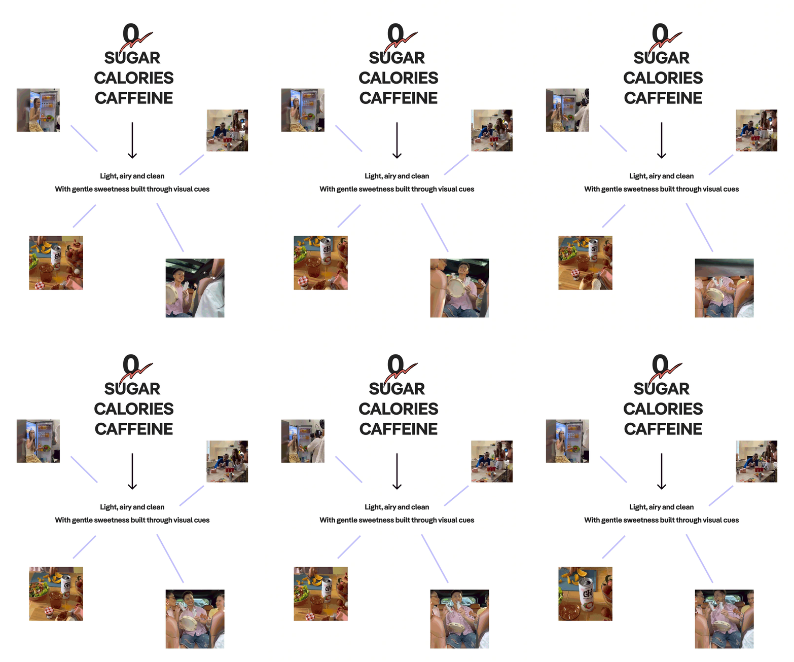
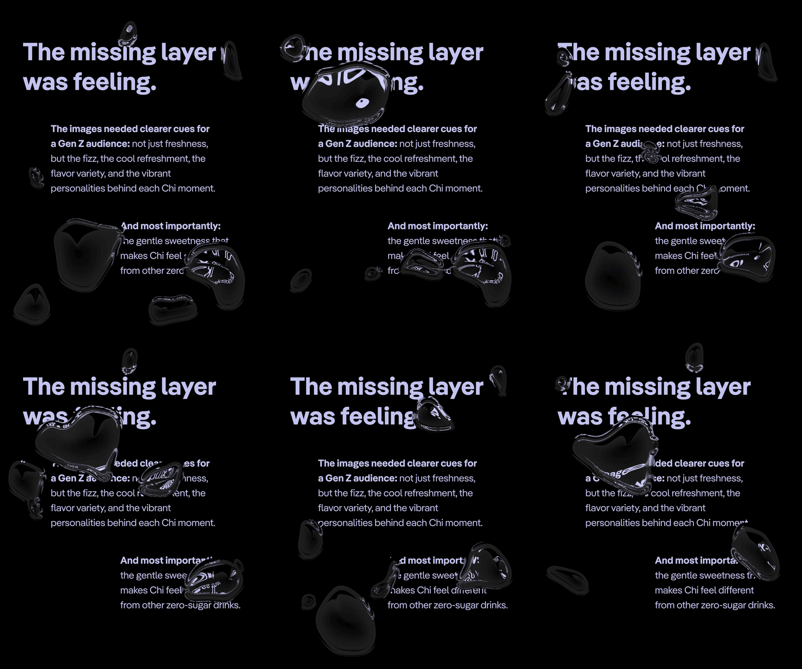
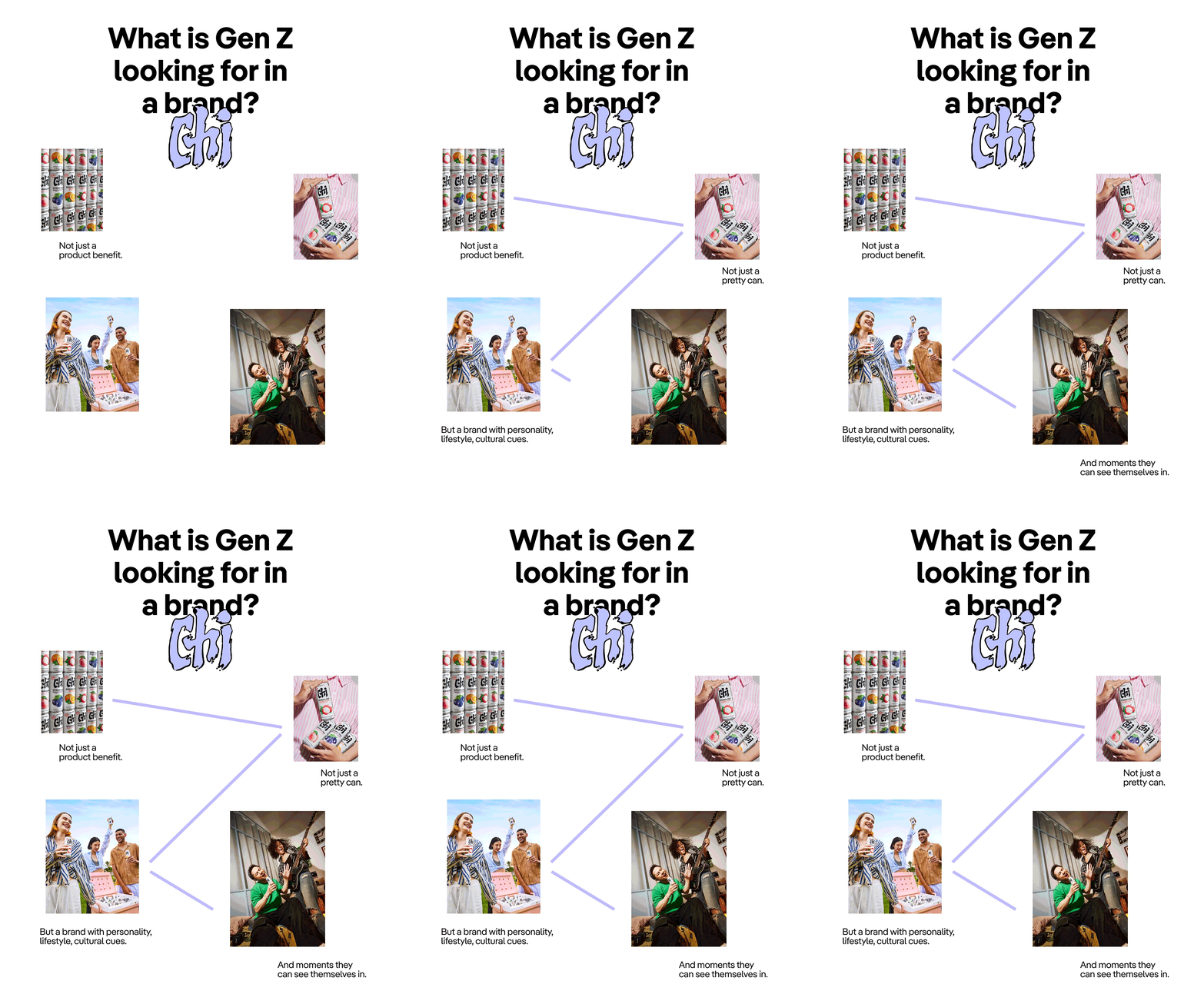
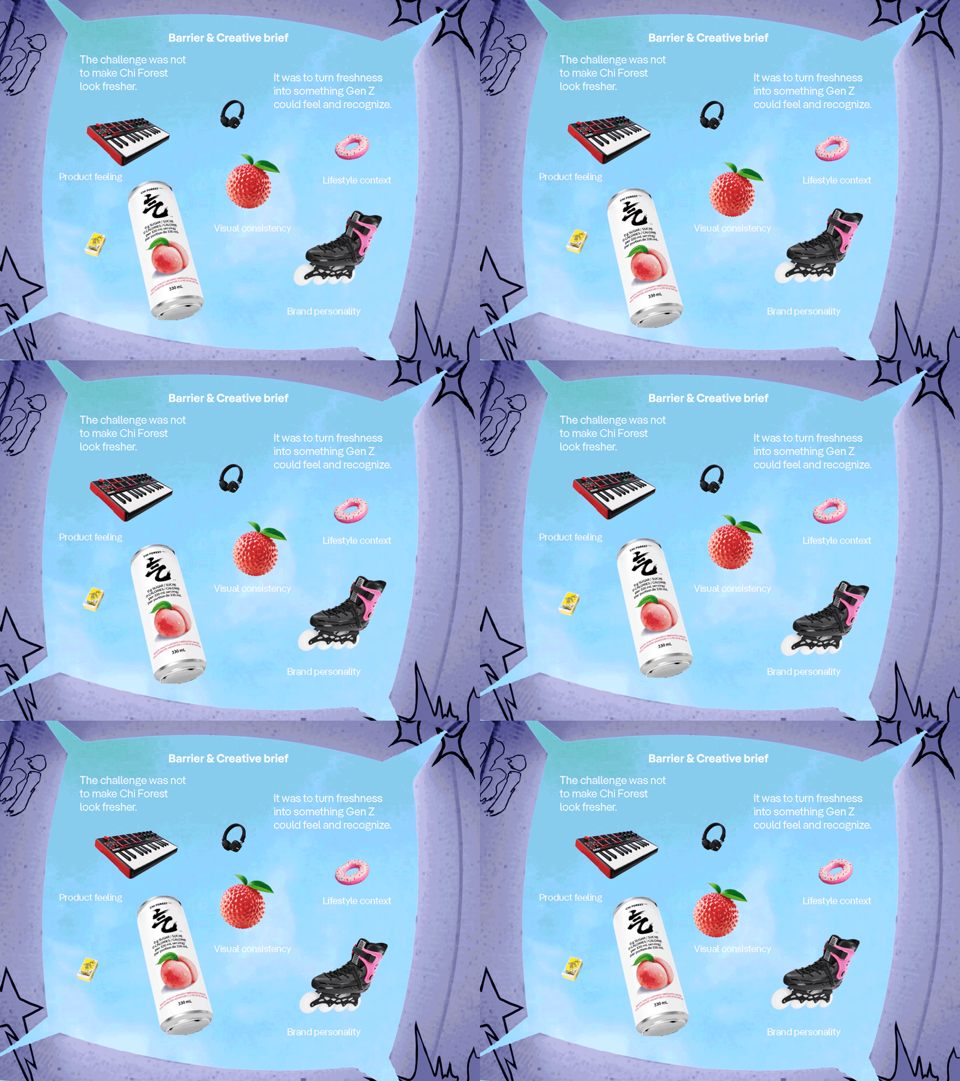
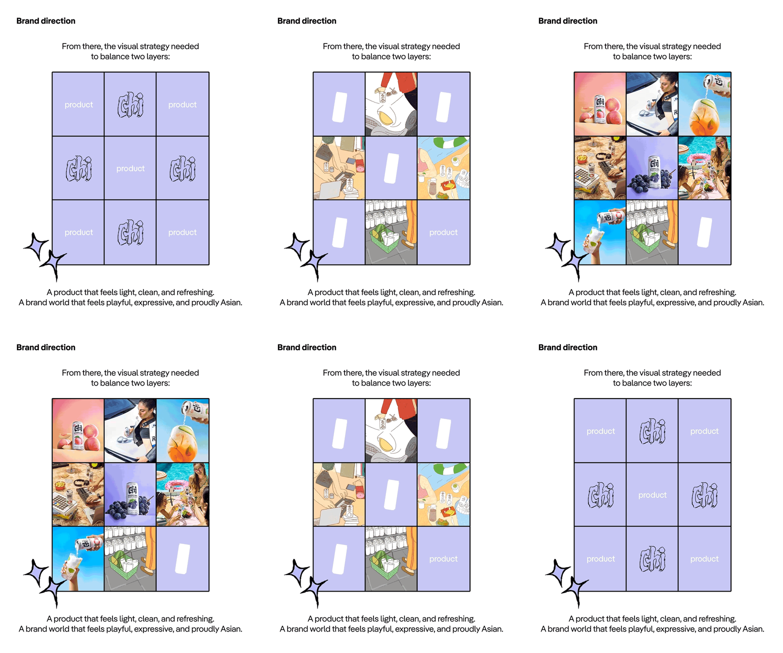
From there, the visual strategy needed to balance two layers:
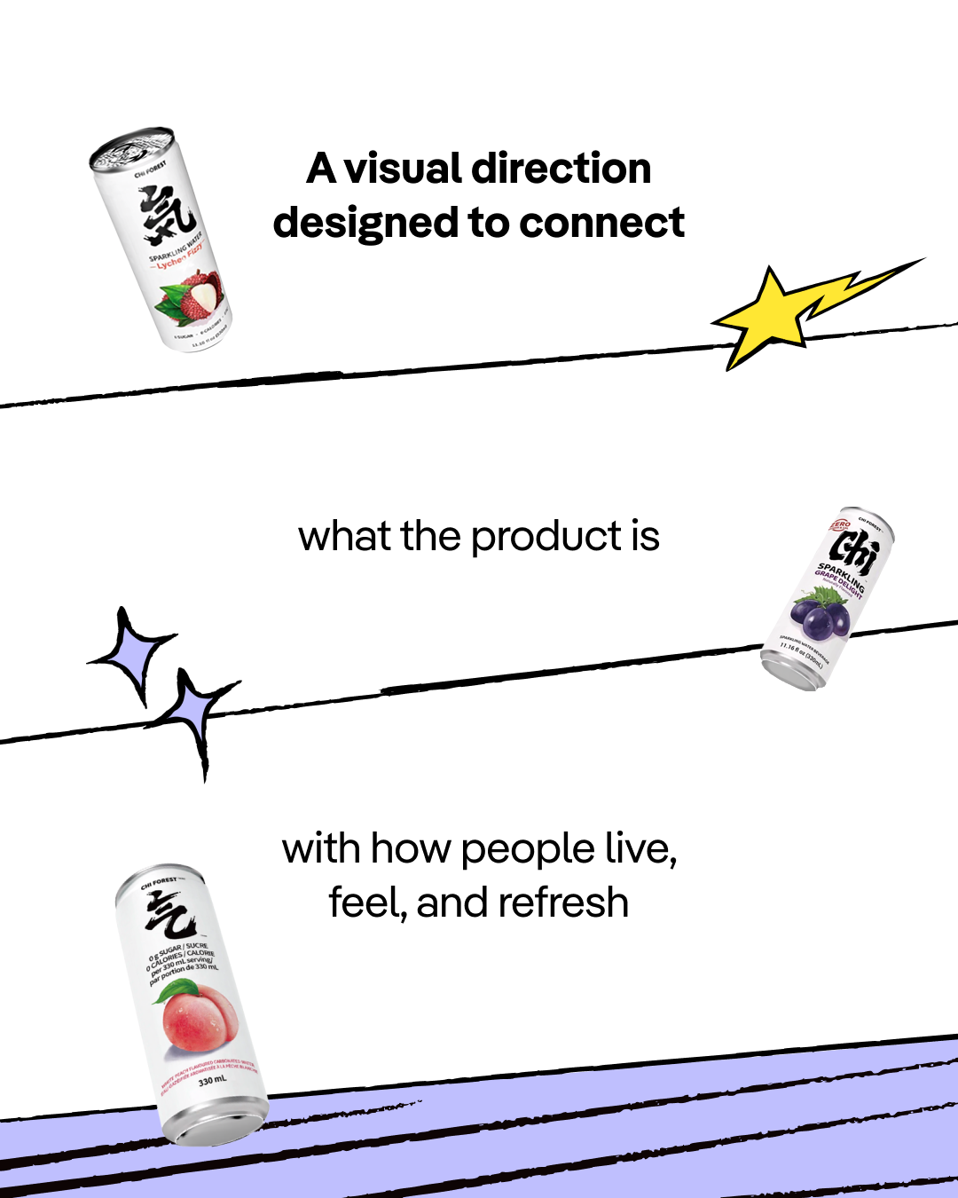
A product that feels light, clean, and refreshing
& A brand world that feels playful, expressive, and proudly Asian.

COOK!
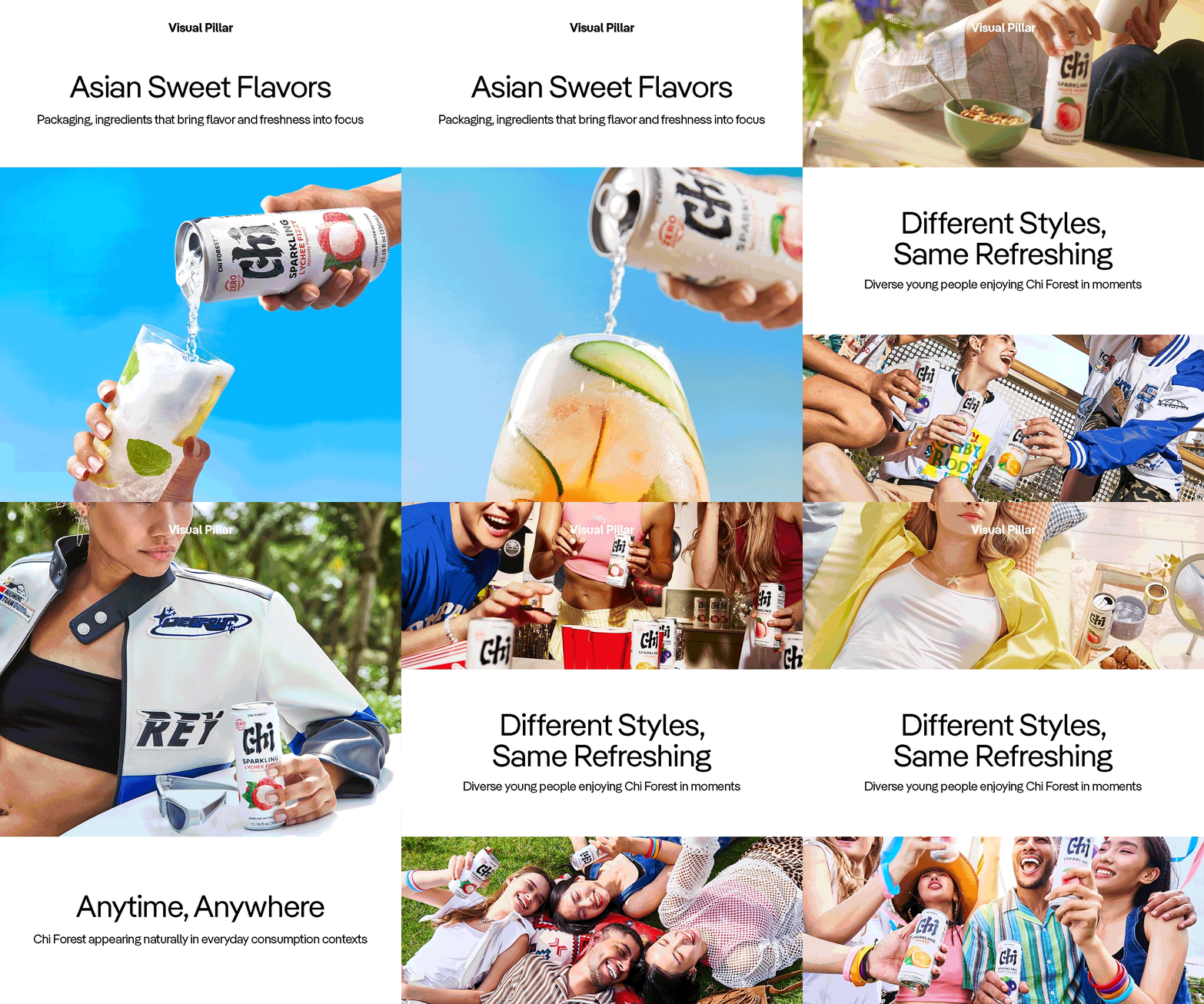
From the big idea, FPDB Creative built a visual system across three main pillars.
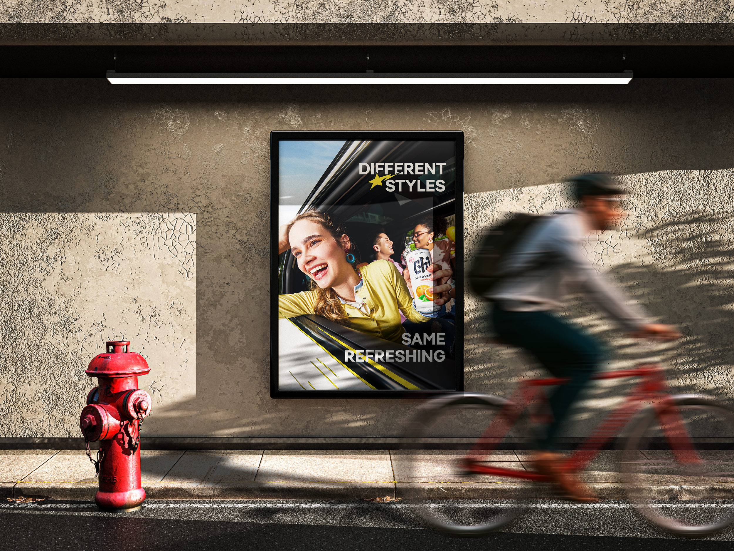
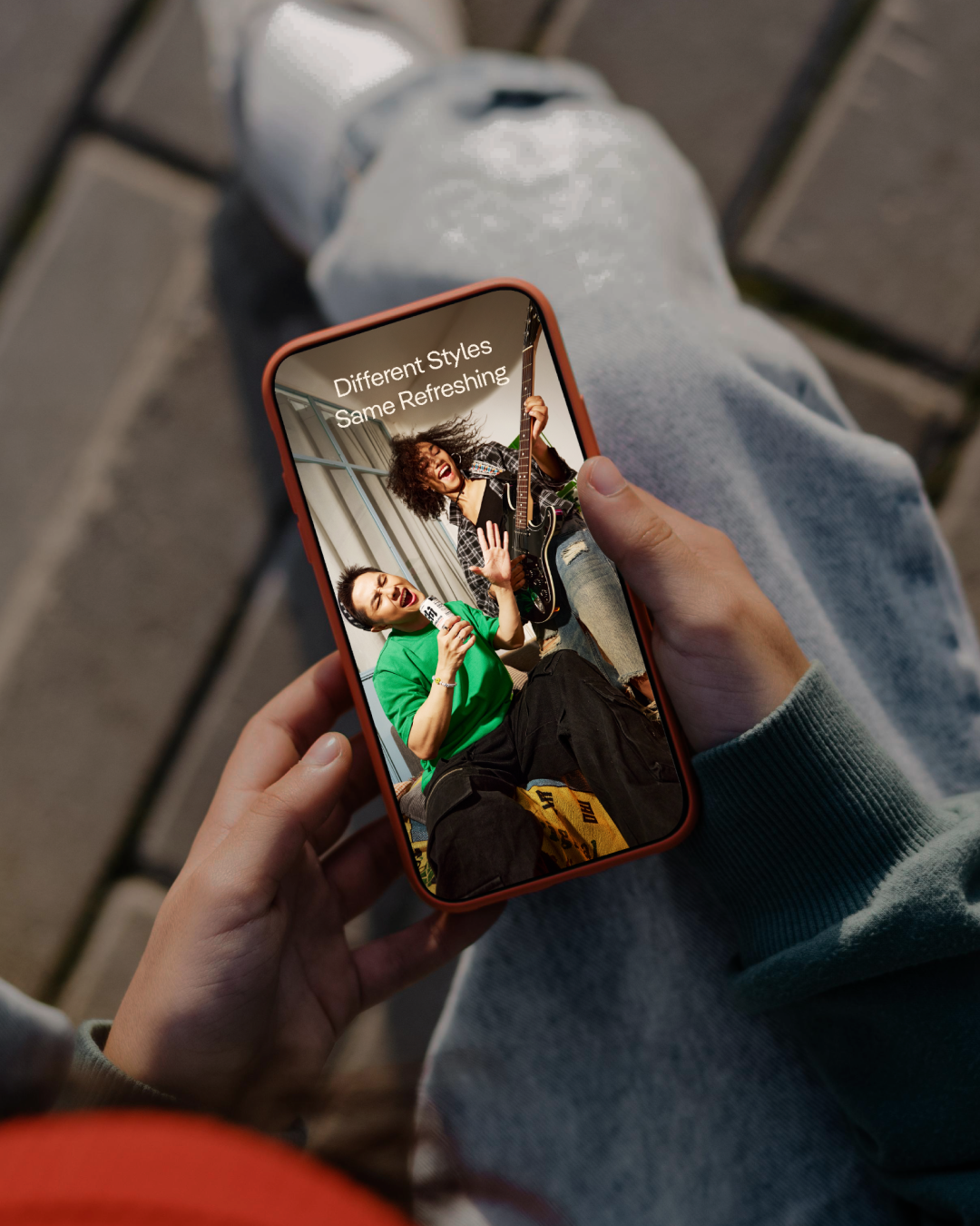
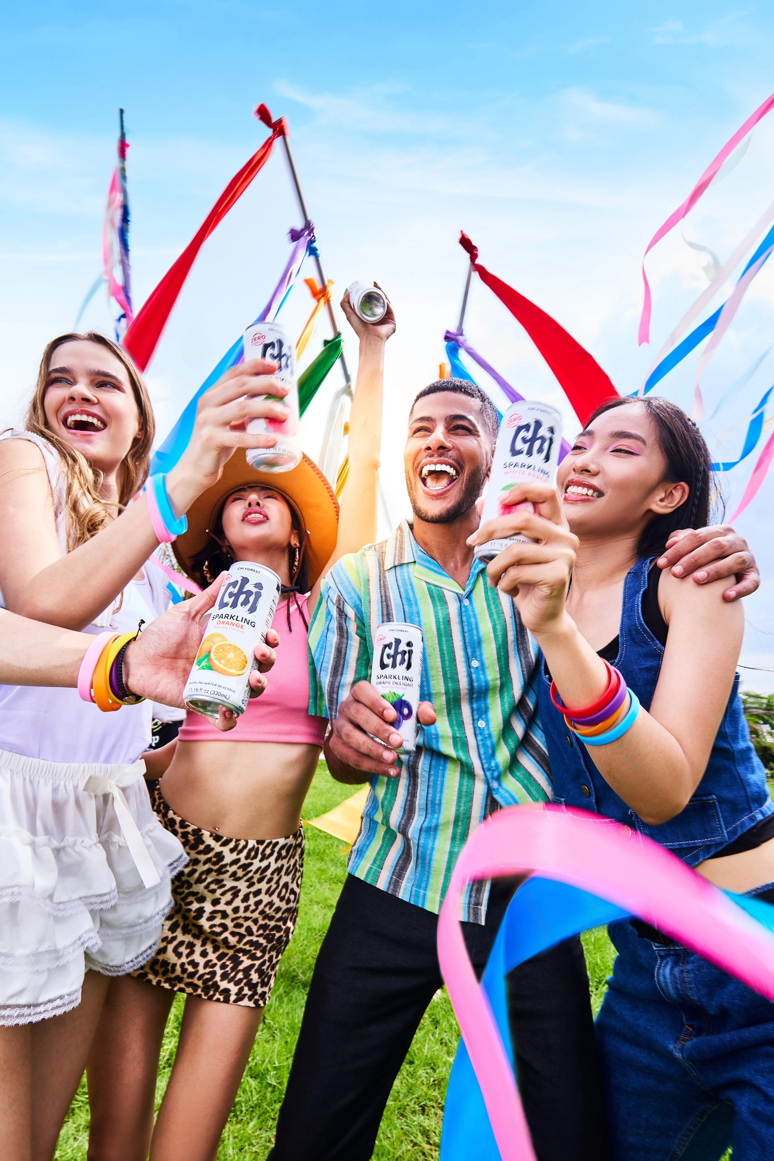
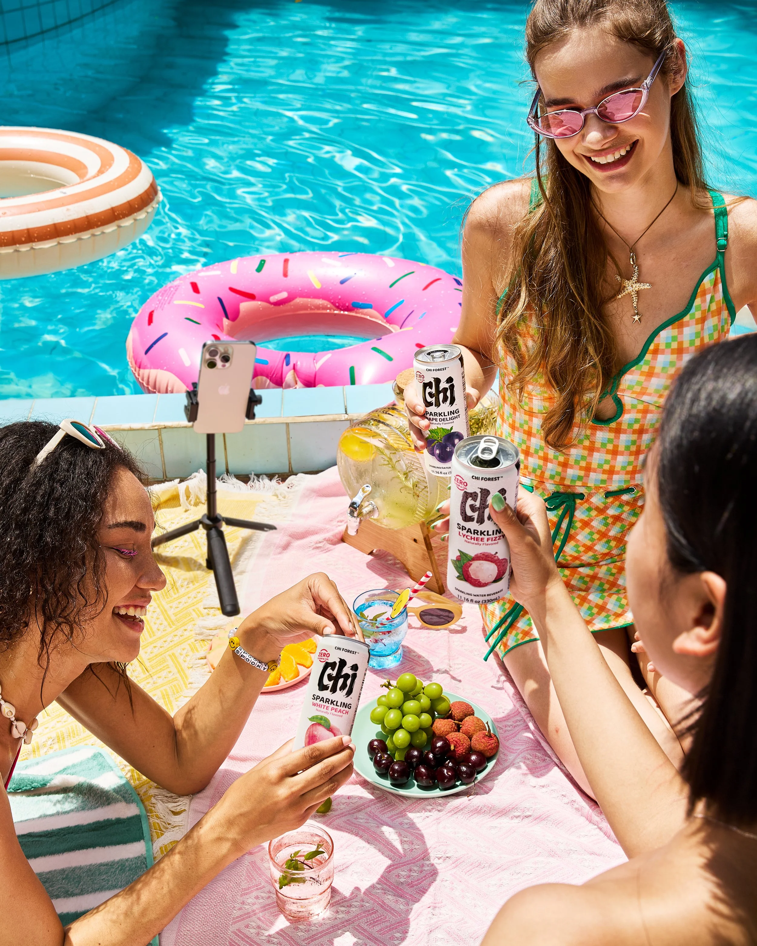
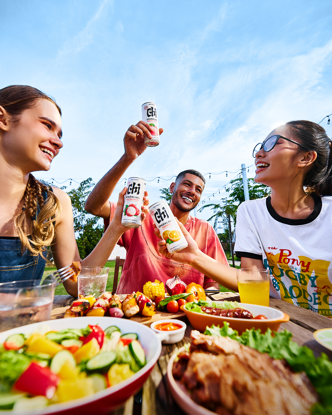
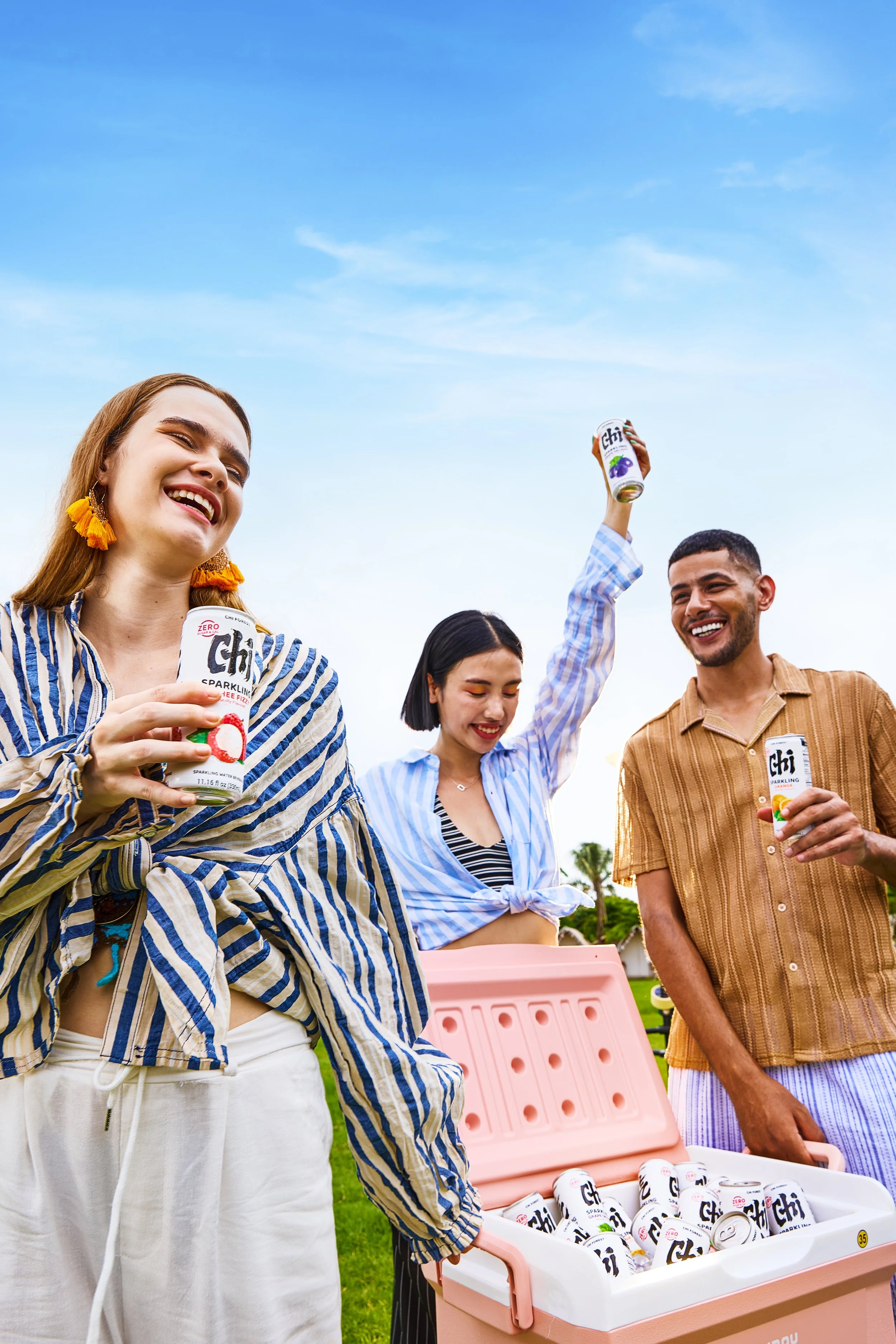
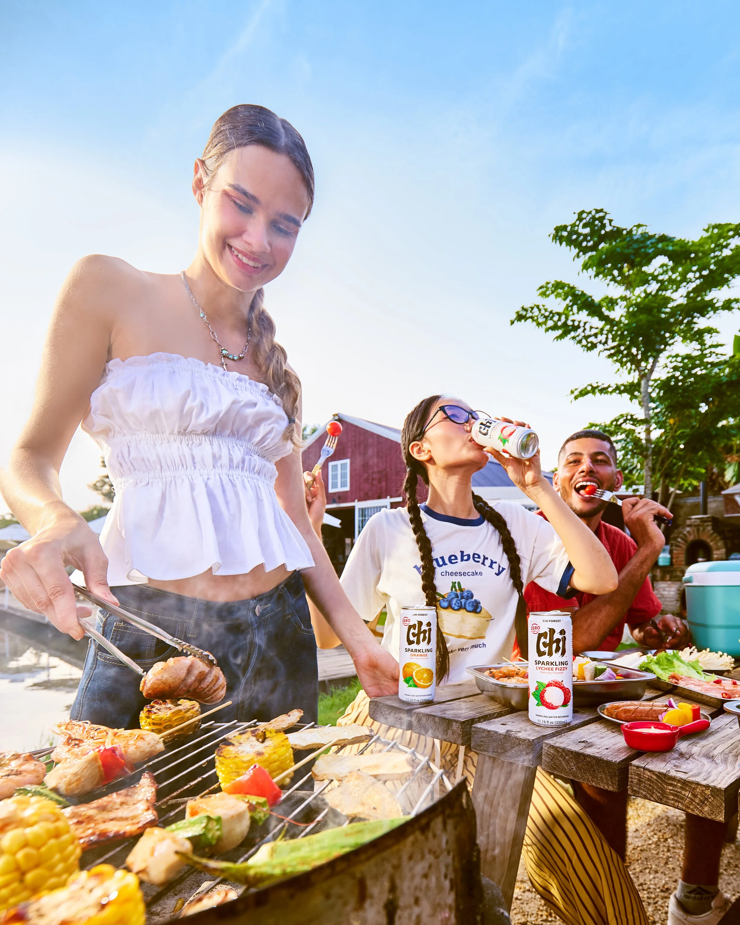
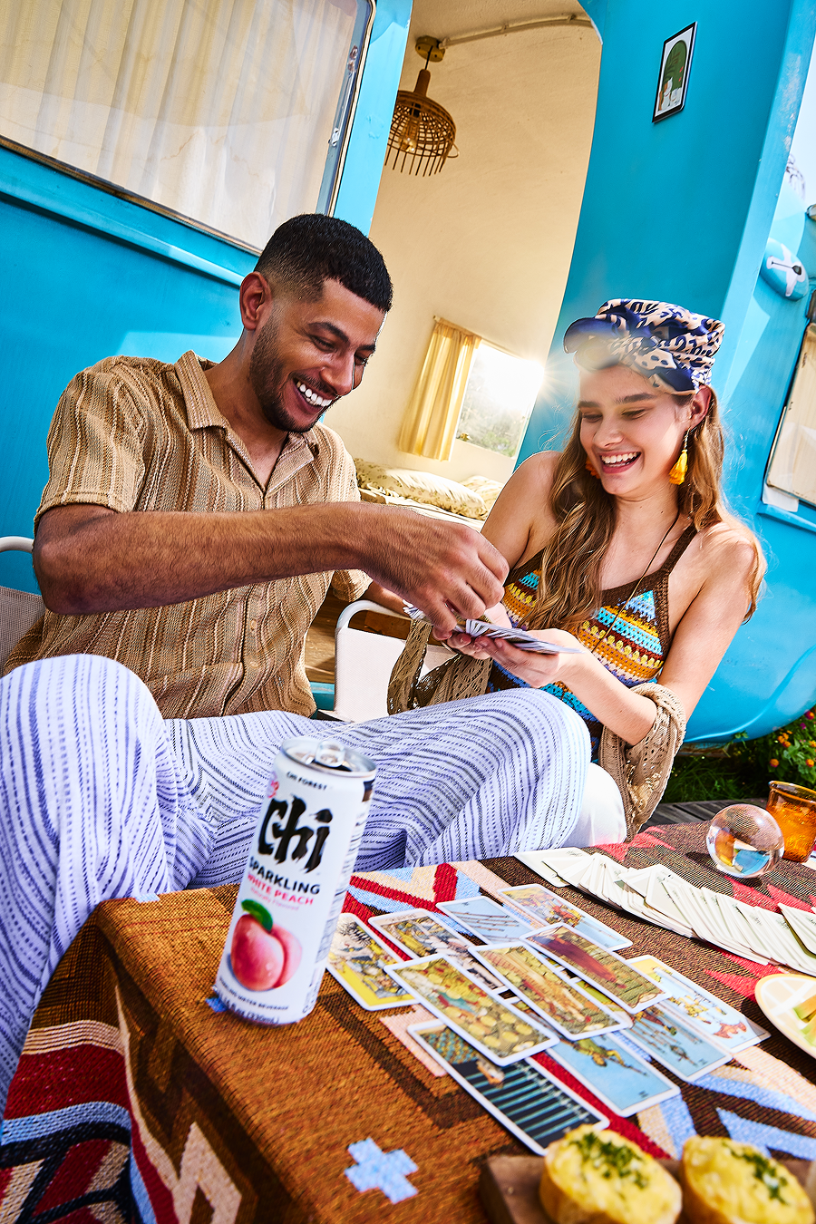
01 - Different Styles, Same Refreshing:
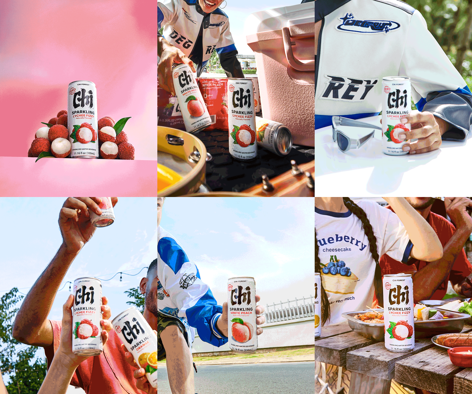
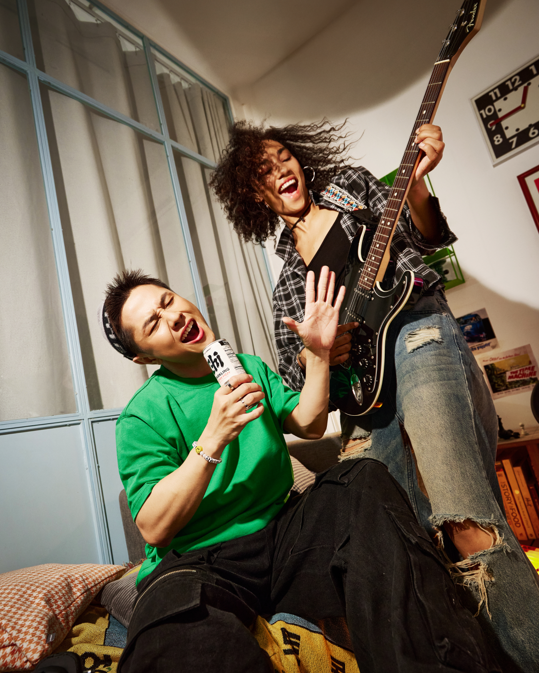
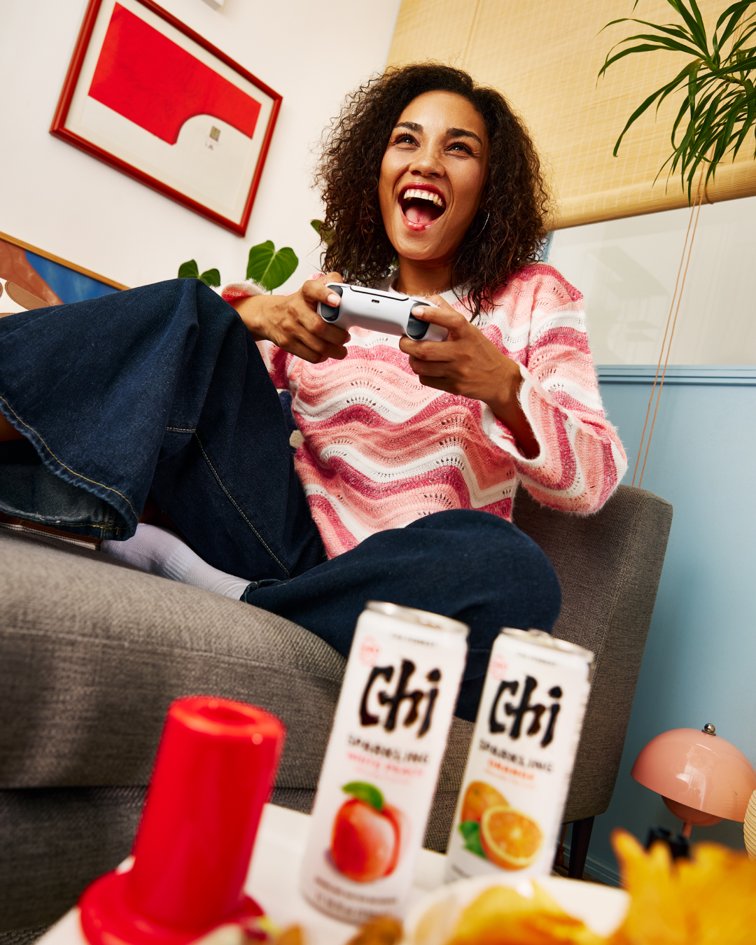
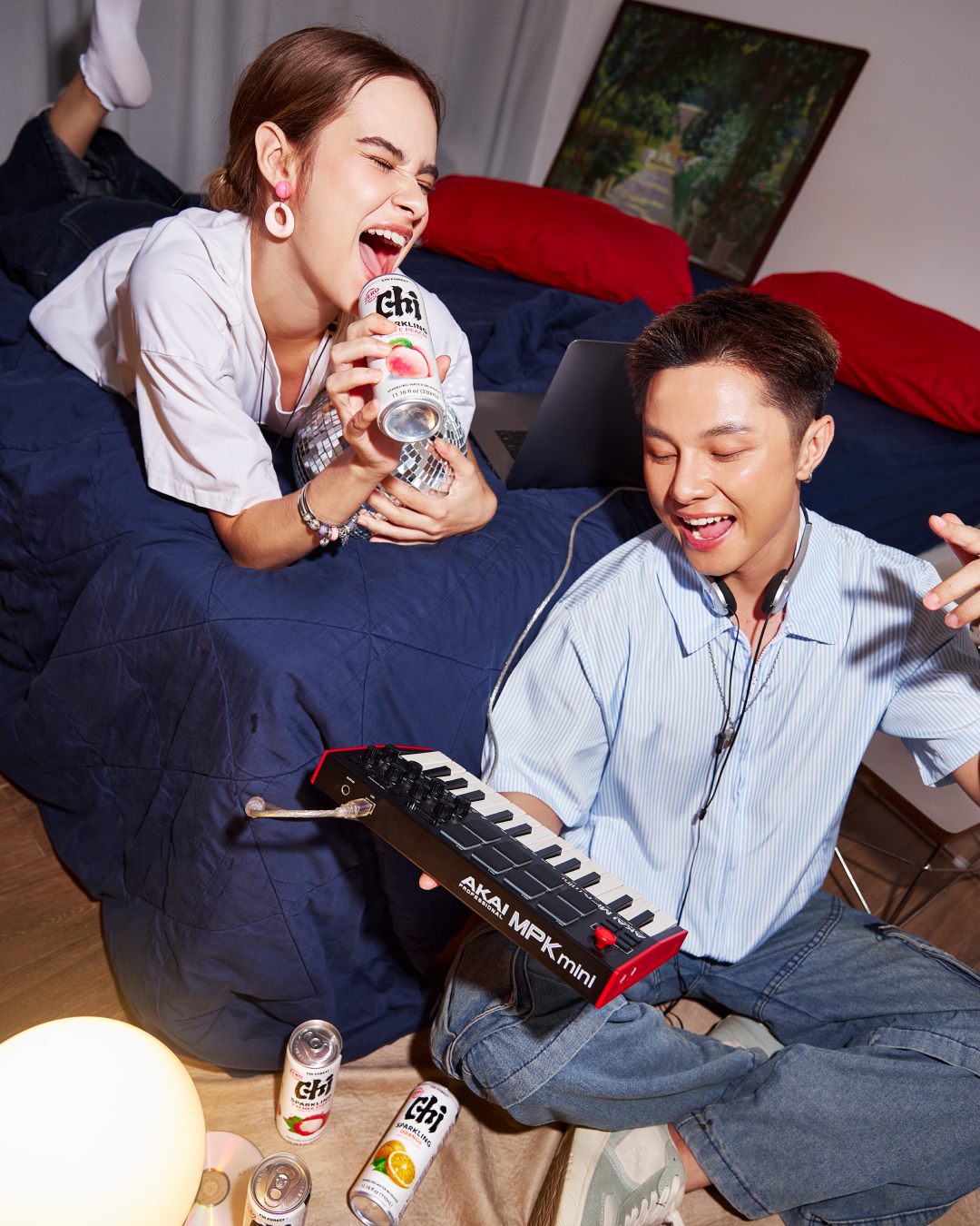
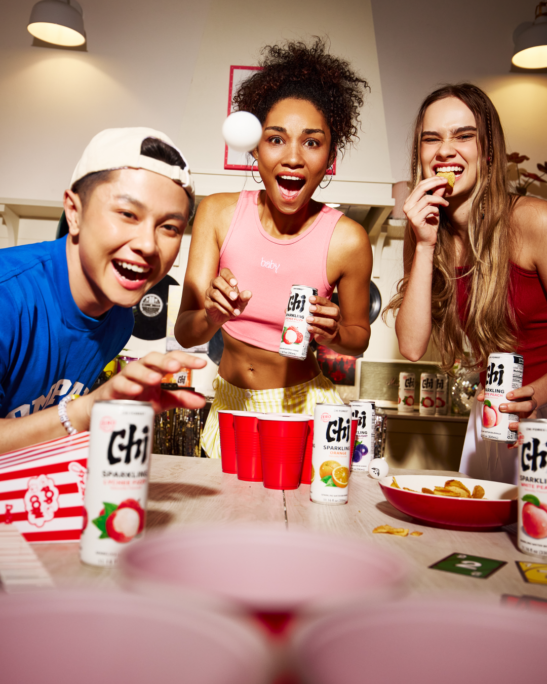
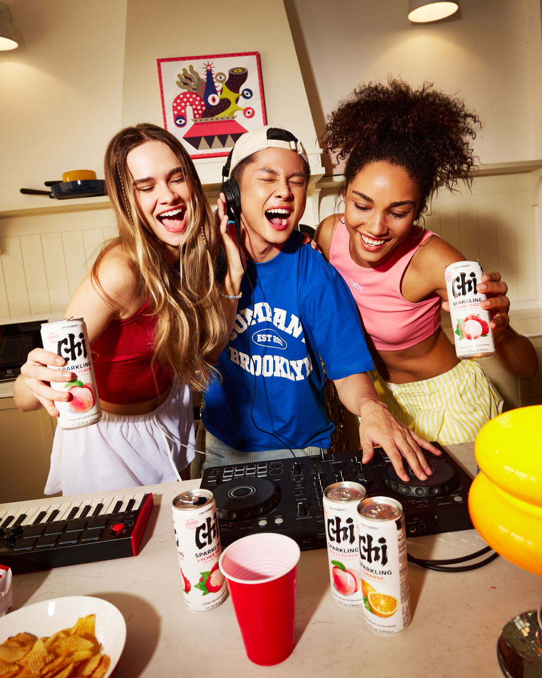
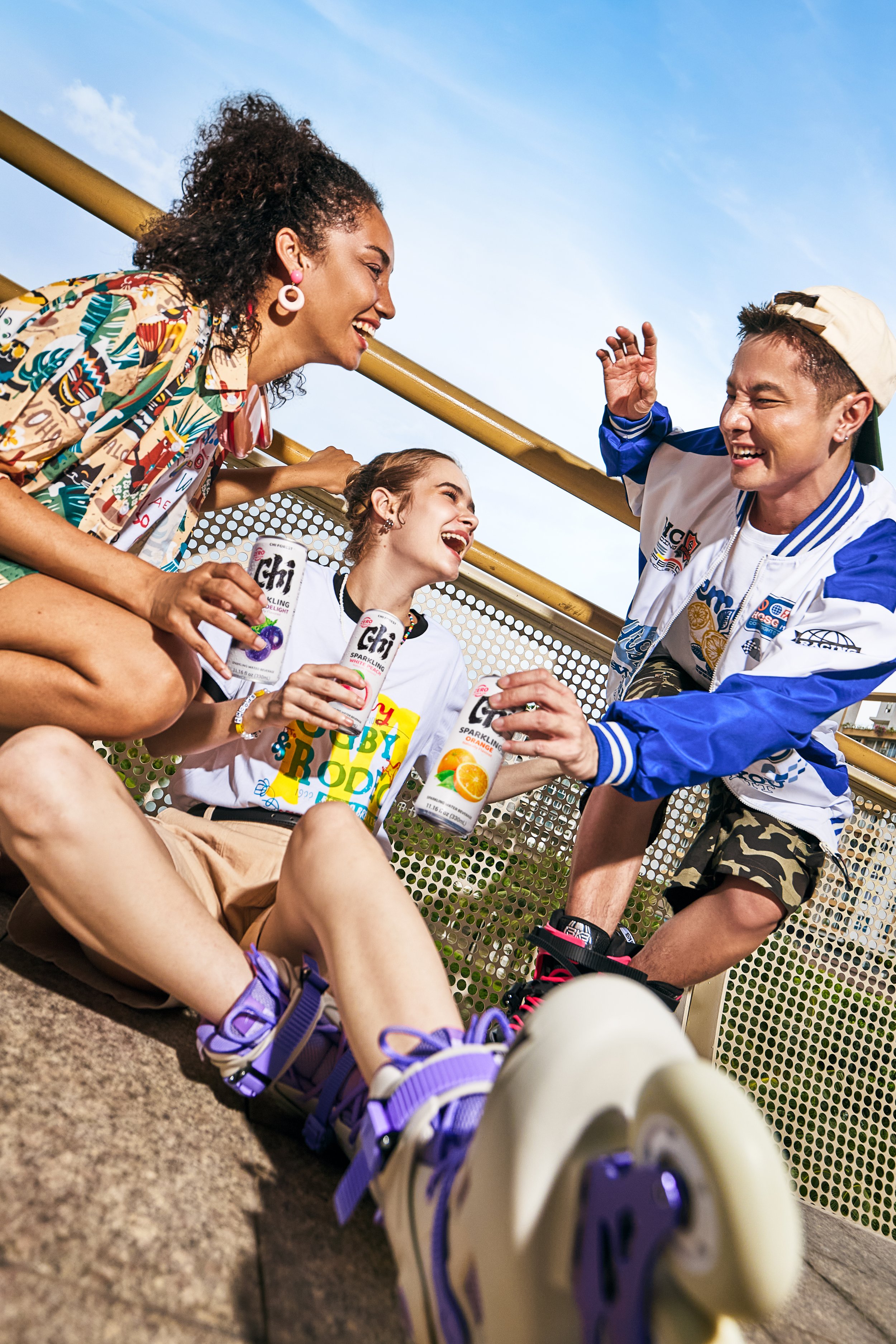
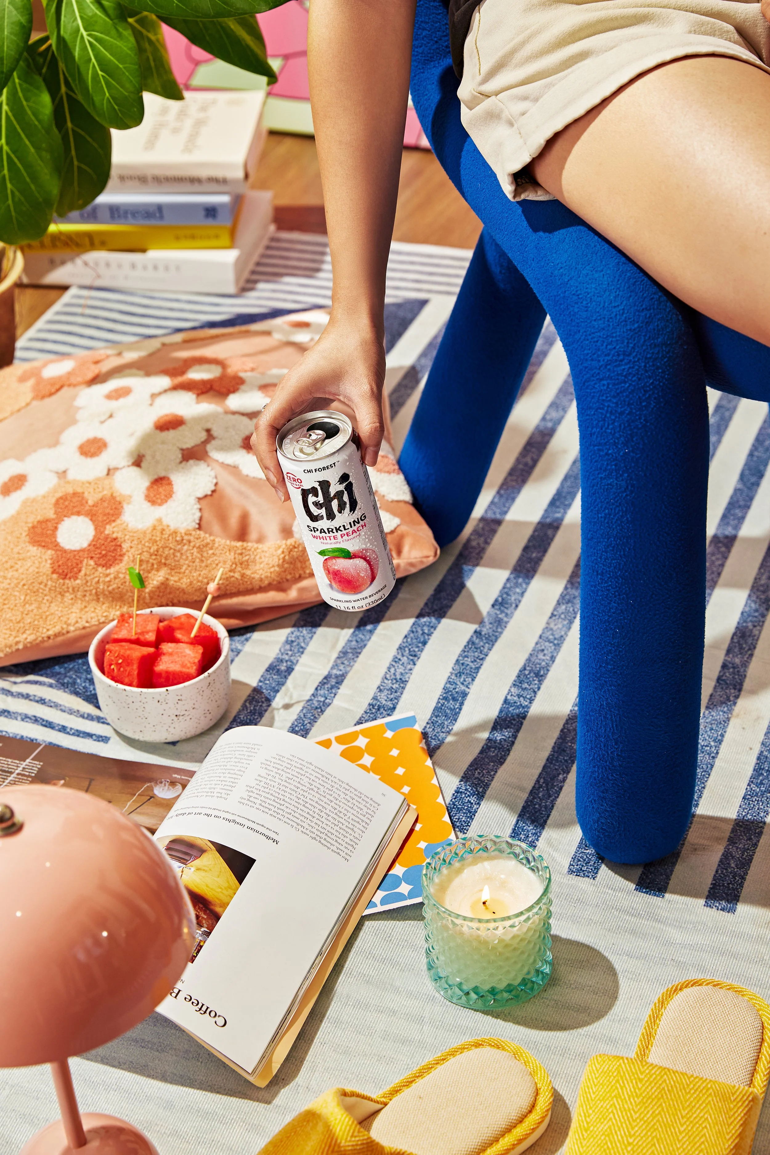
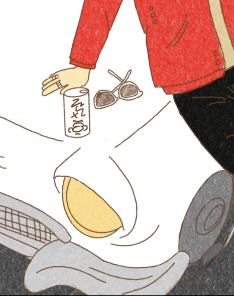
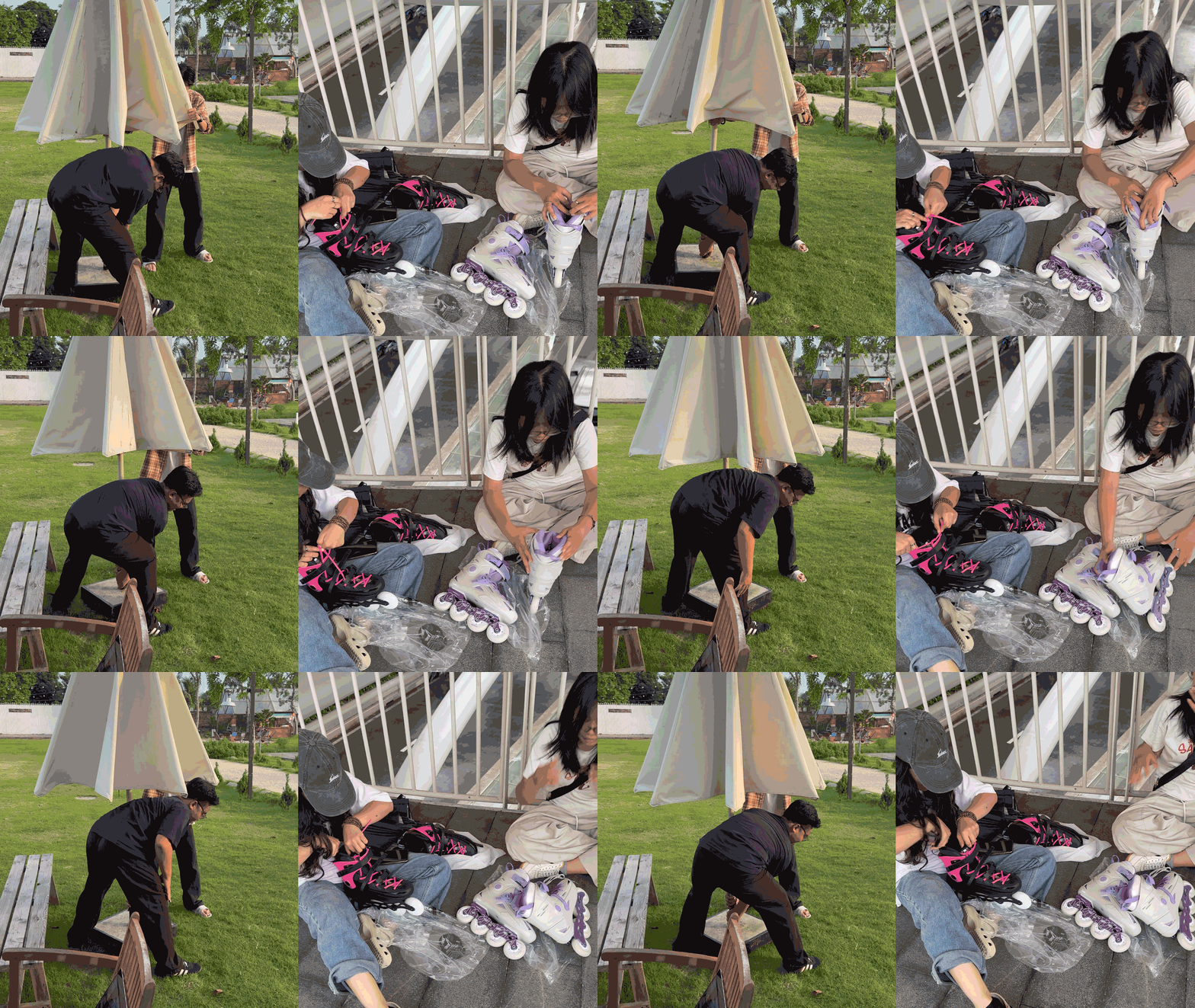
Diverse young people across different professions, ages, and personalities enjoying Chi Forest
in moments that feel free, natural, and balanced.
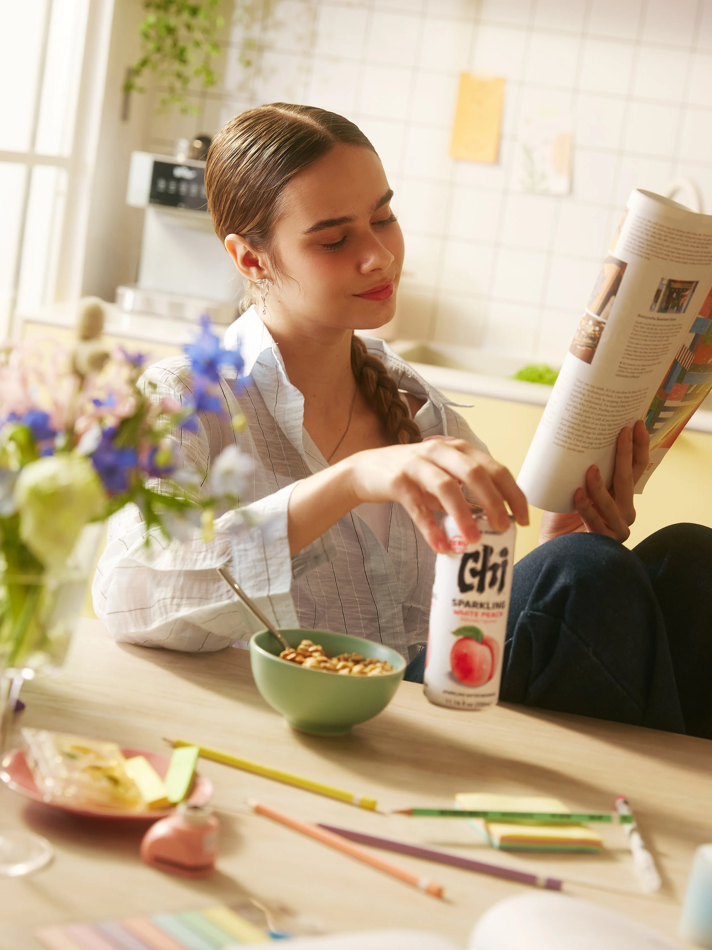
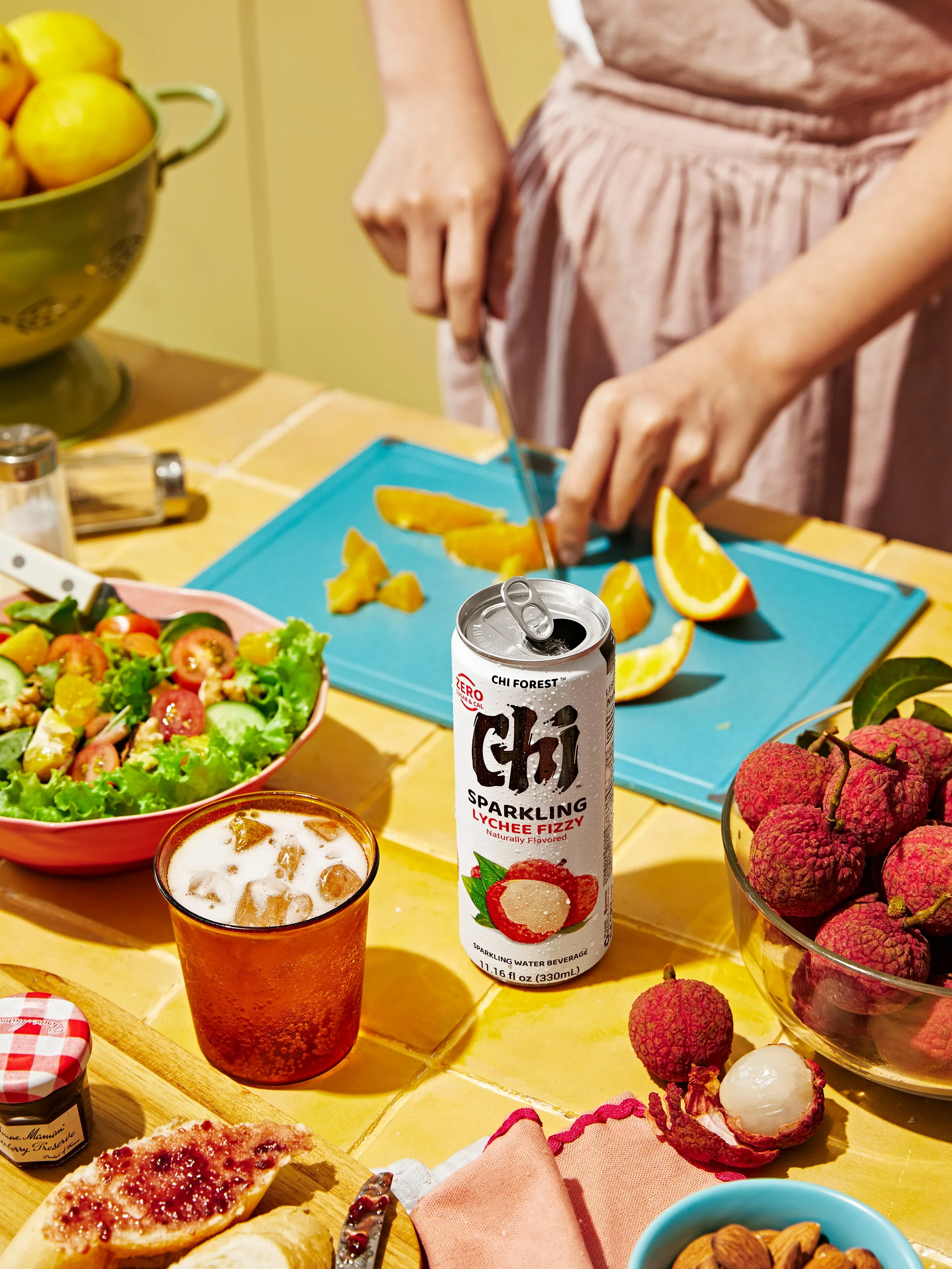
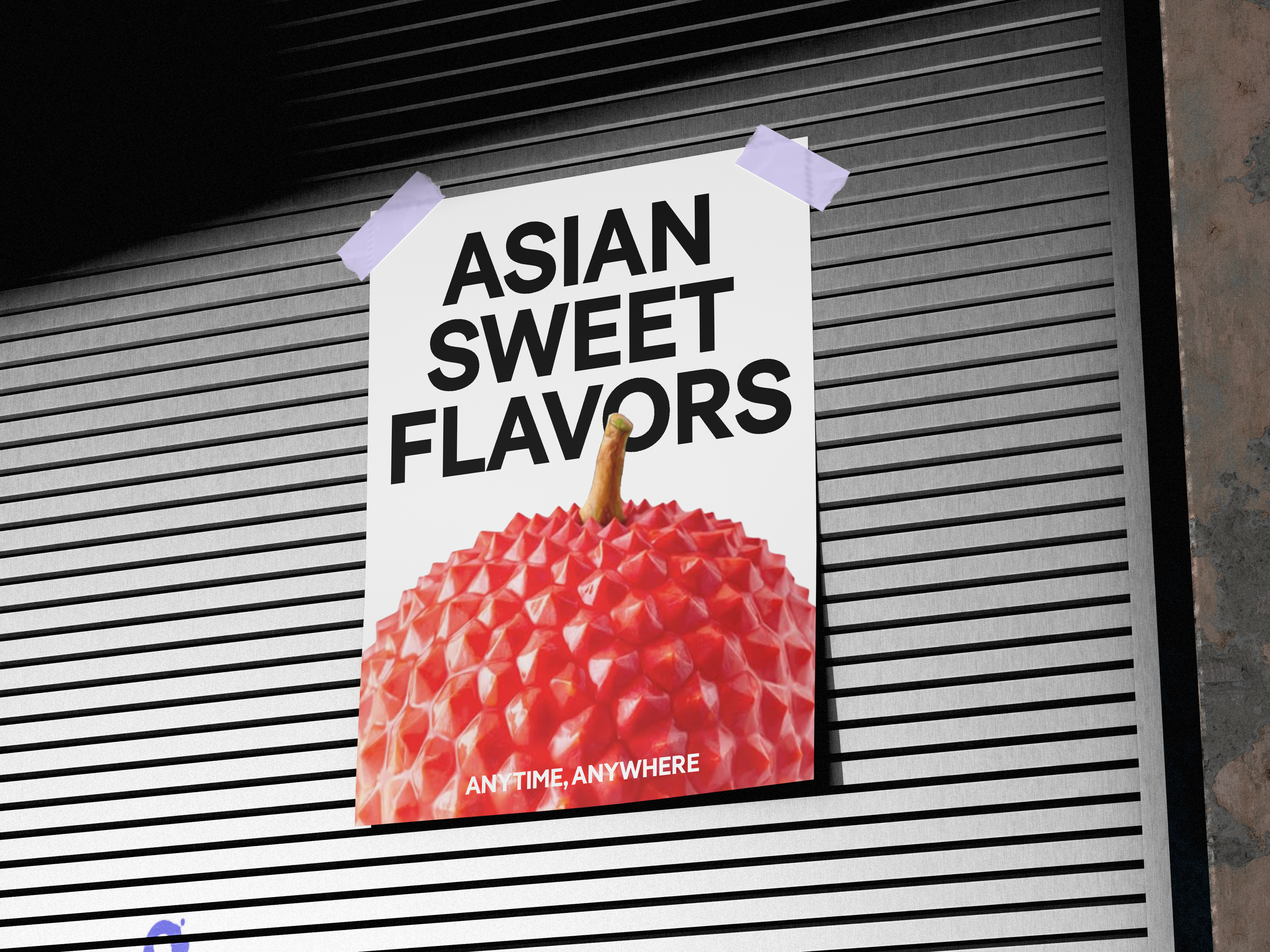
02 - Asian Sweet Flavors:
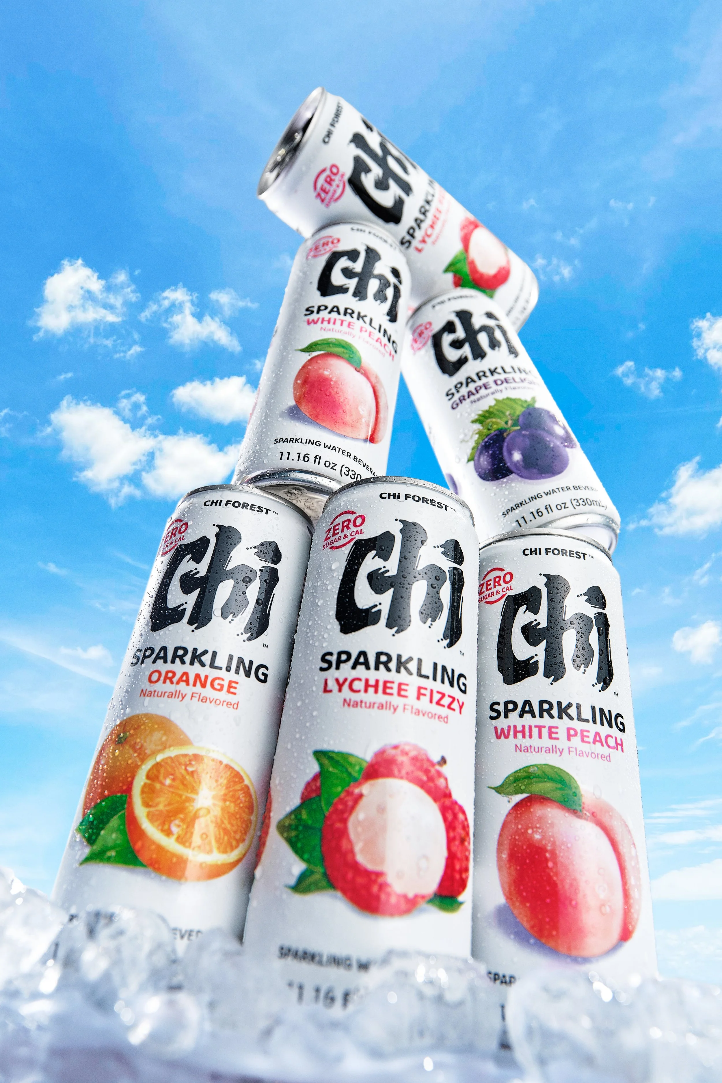
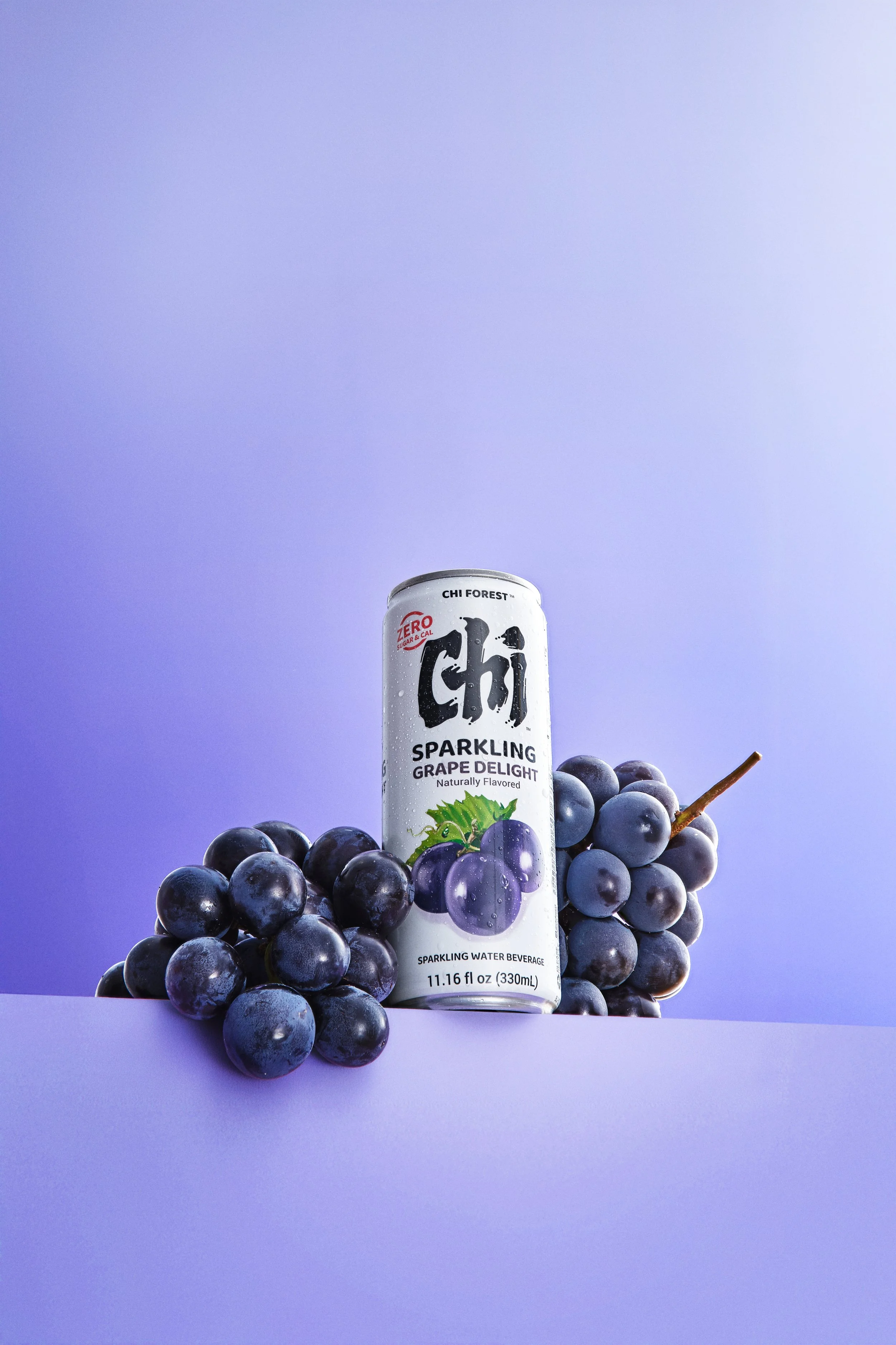
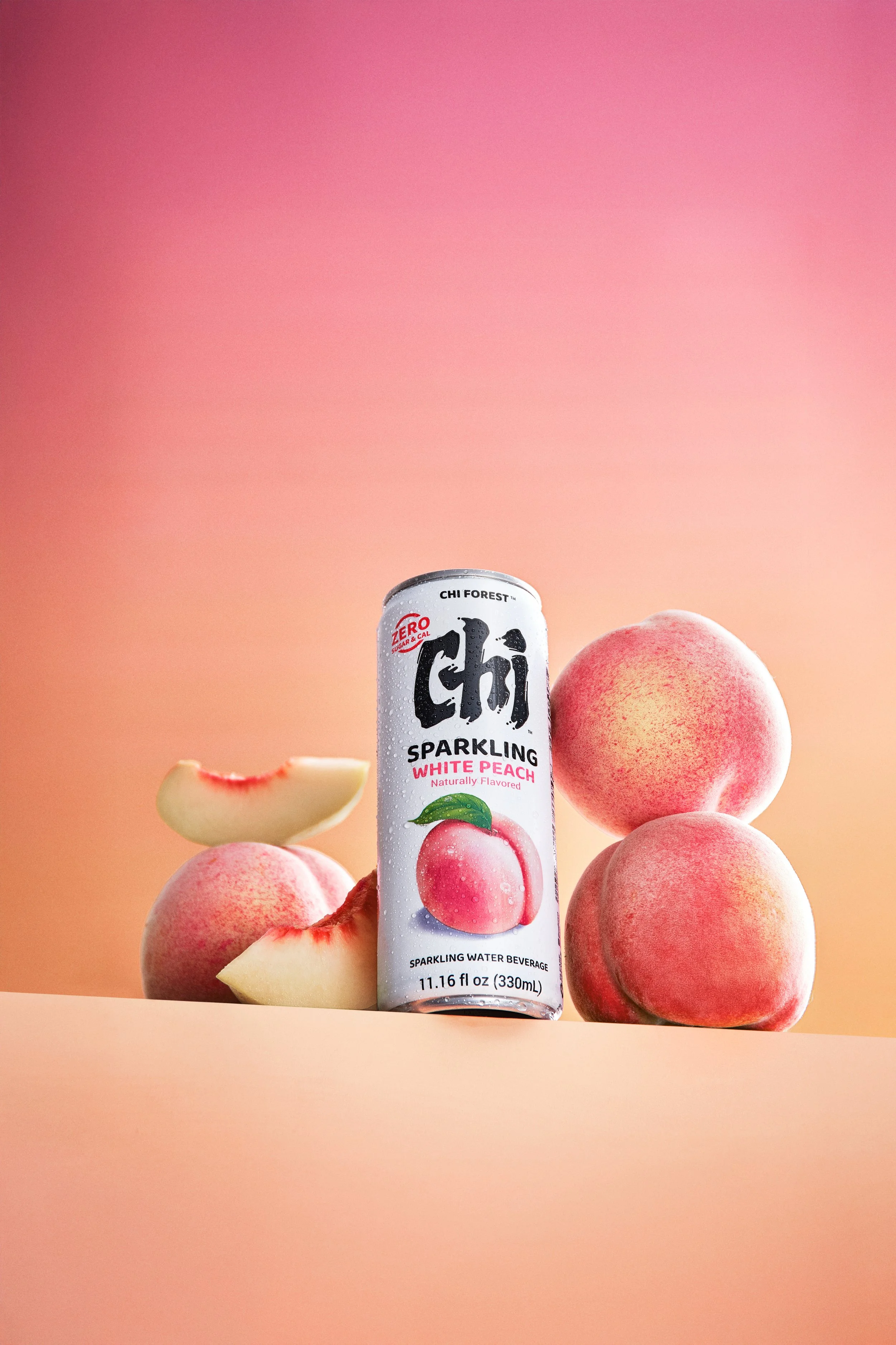
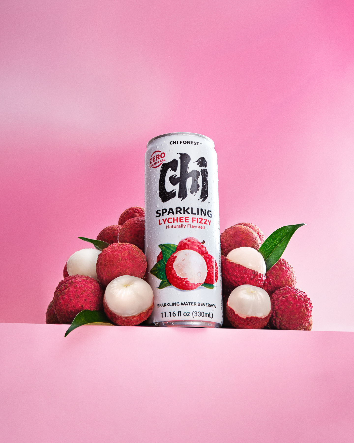
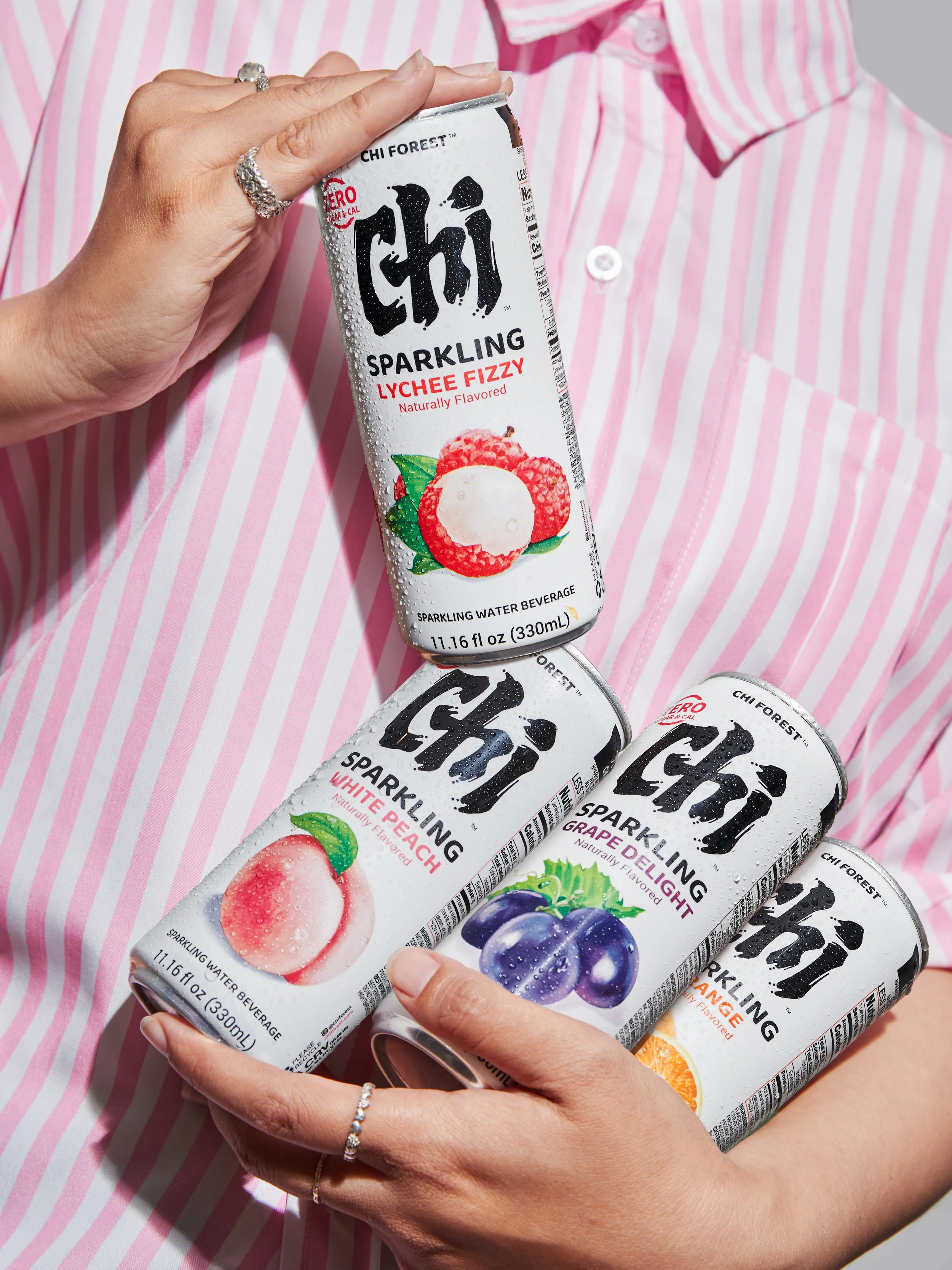
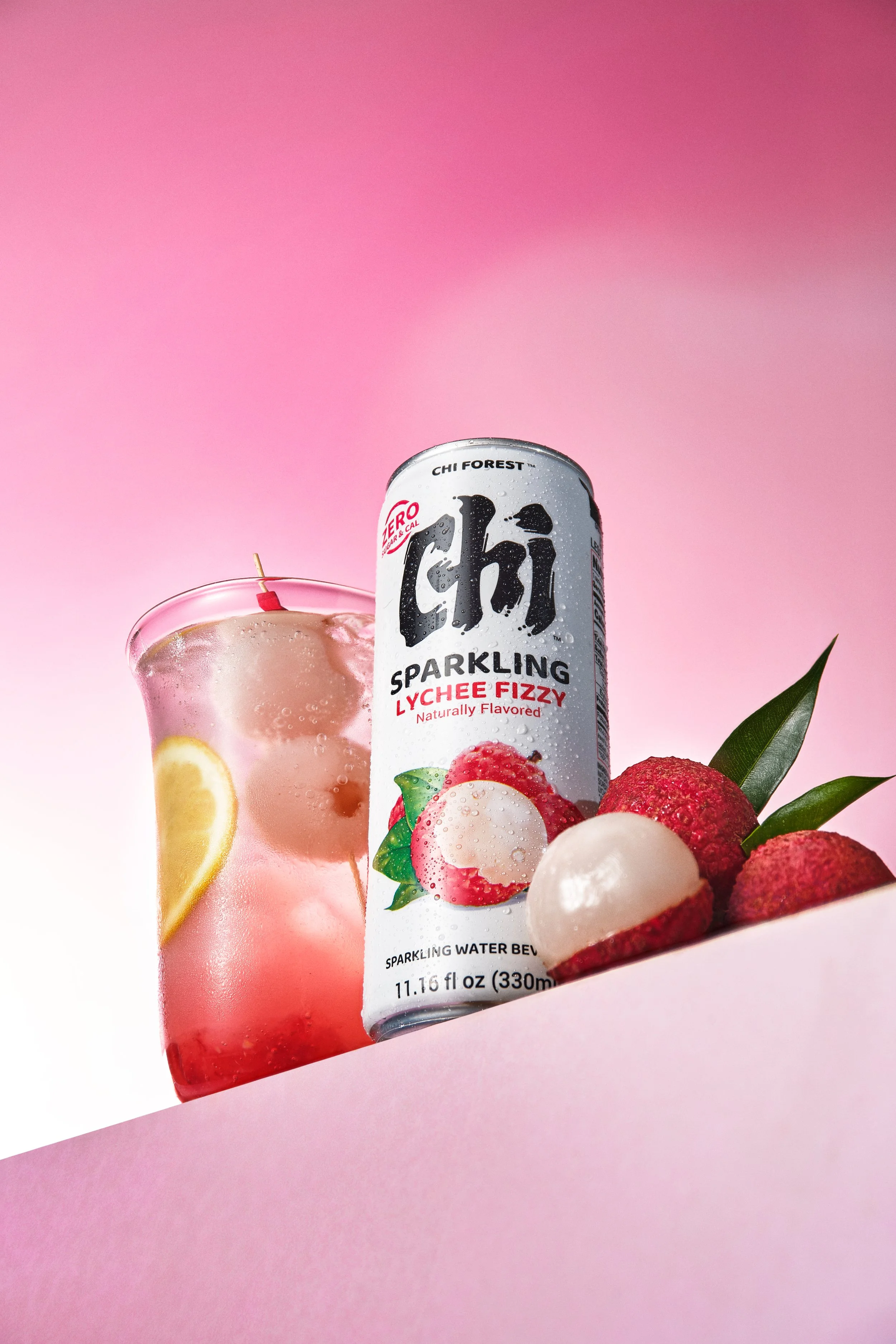
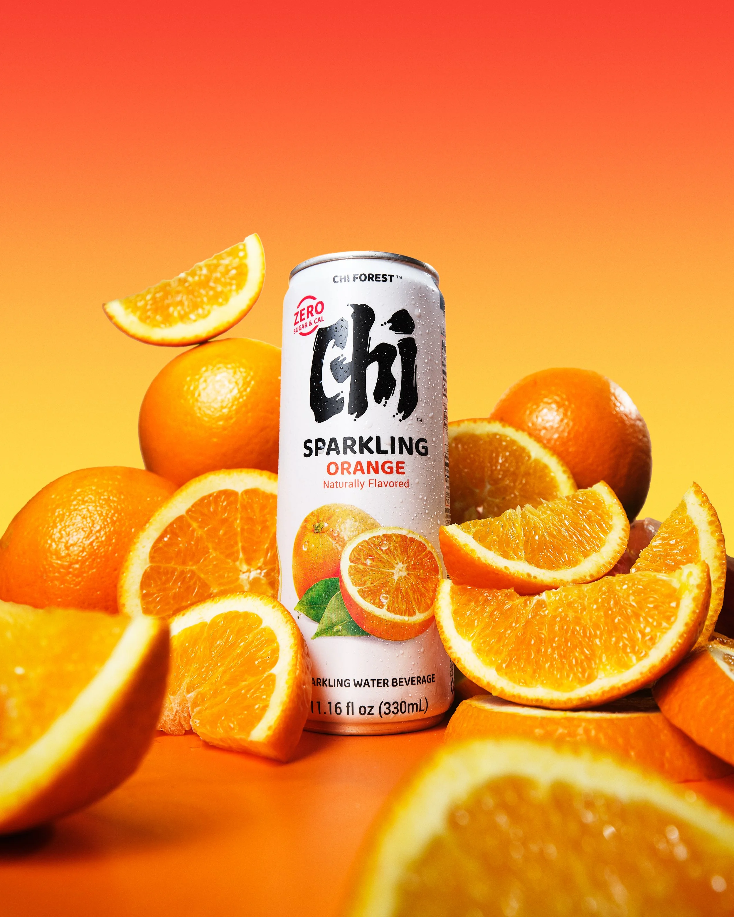
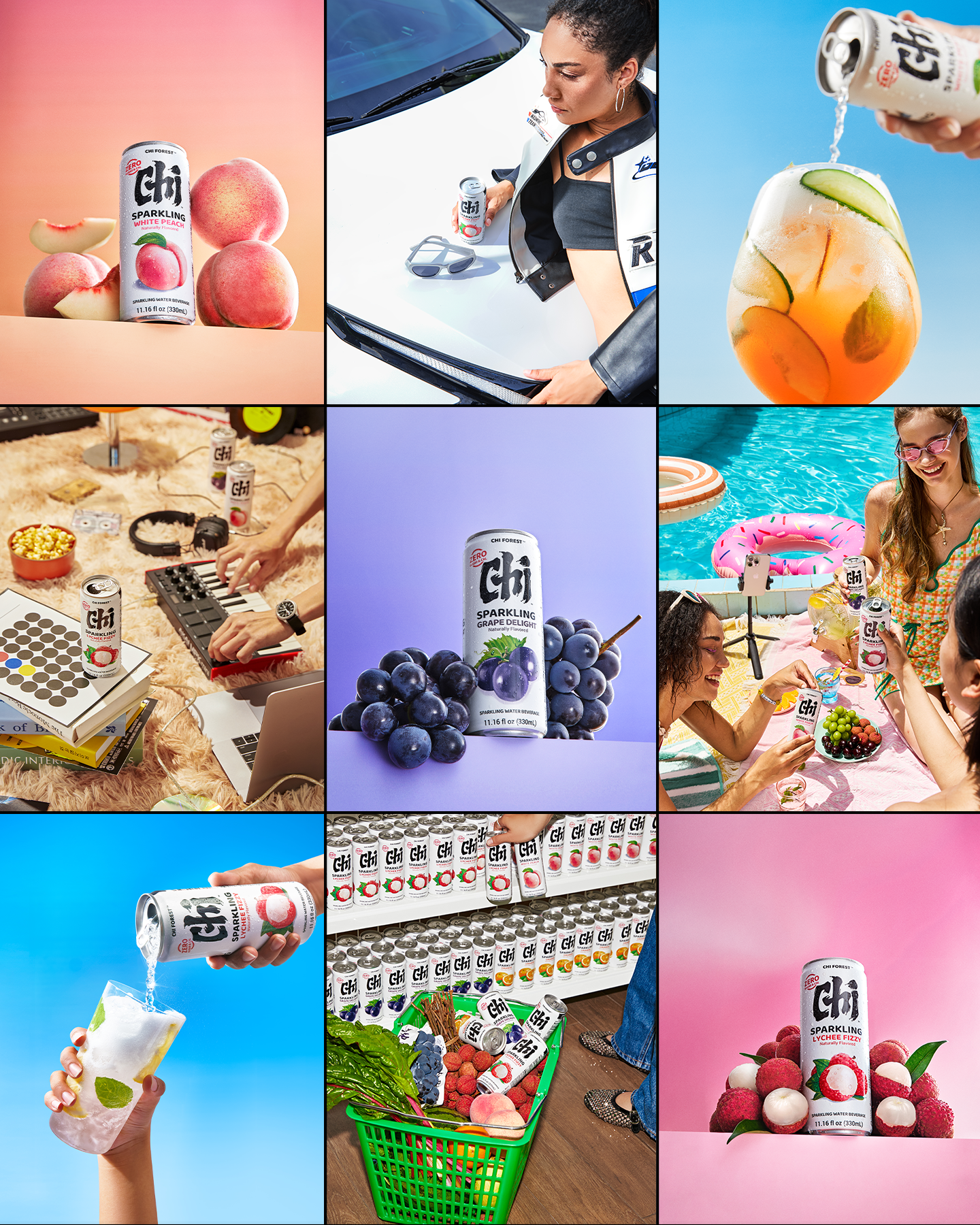
Packaging, texture, single product shots, fruits, and ingredients that bring flavor and freshness into focus.
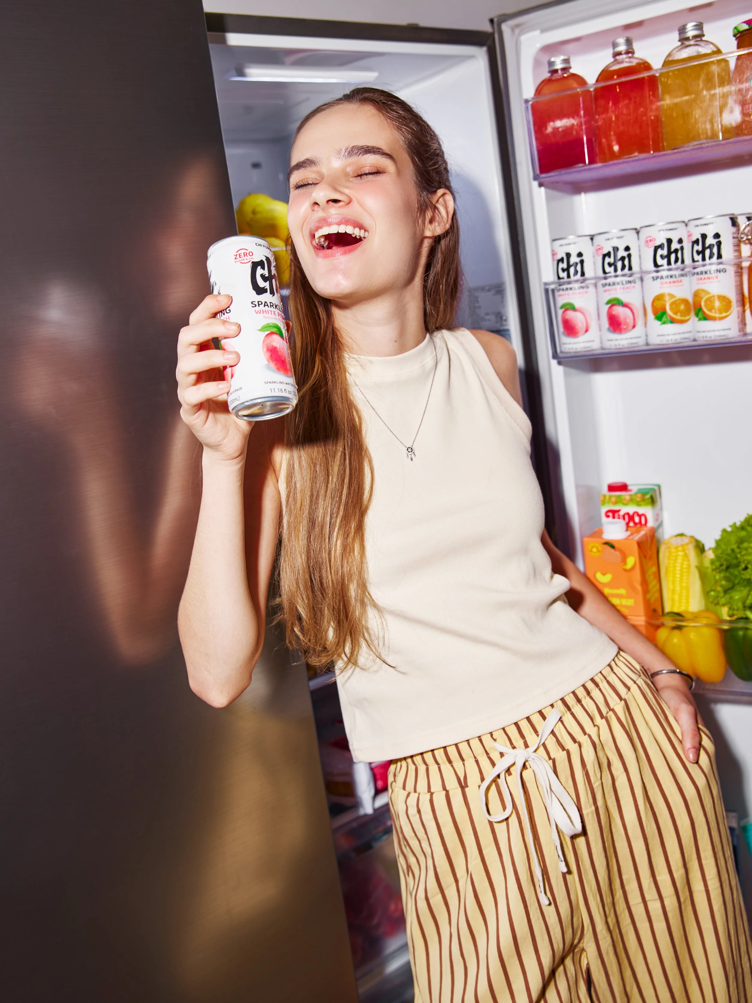
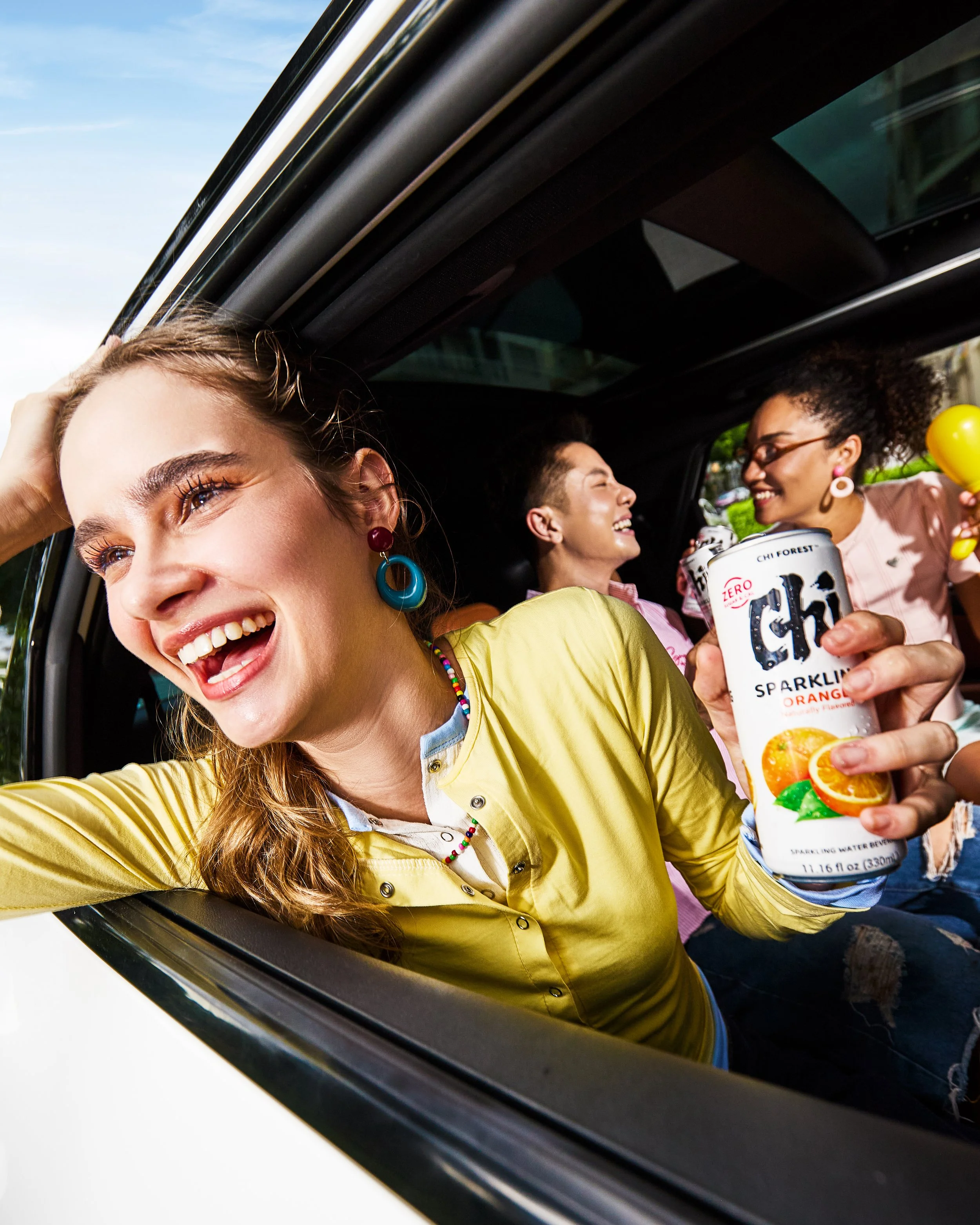
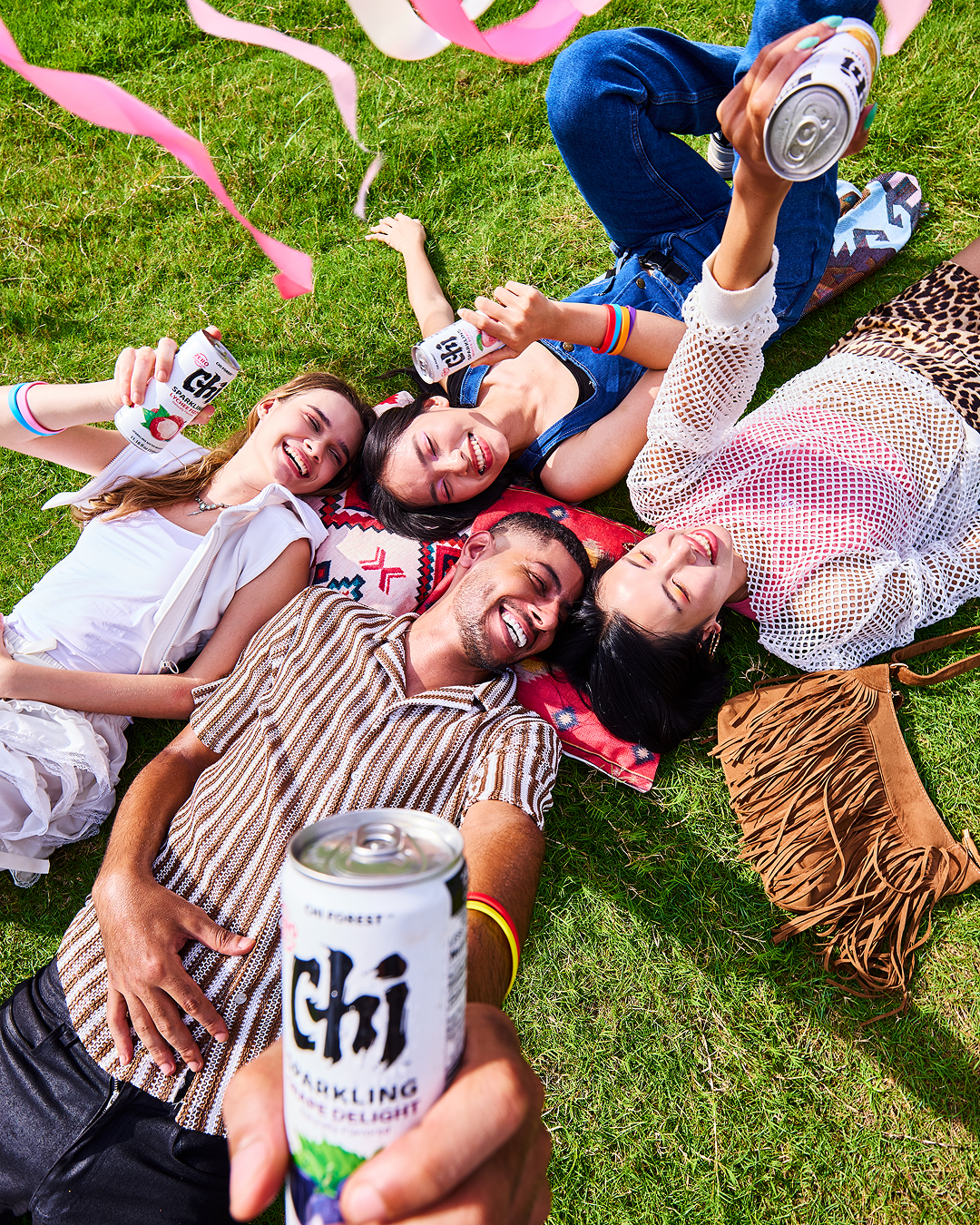
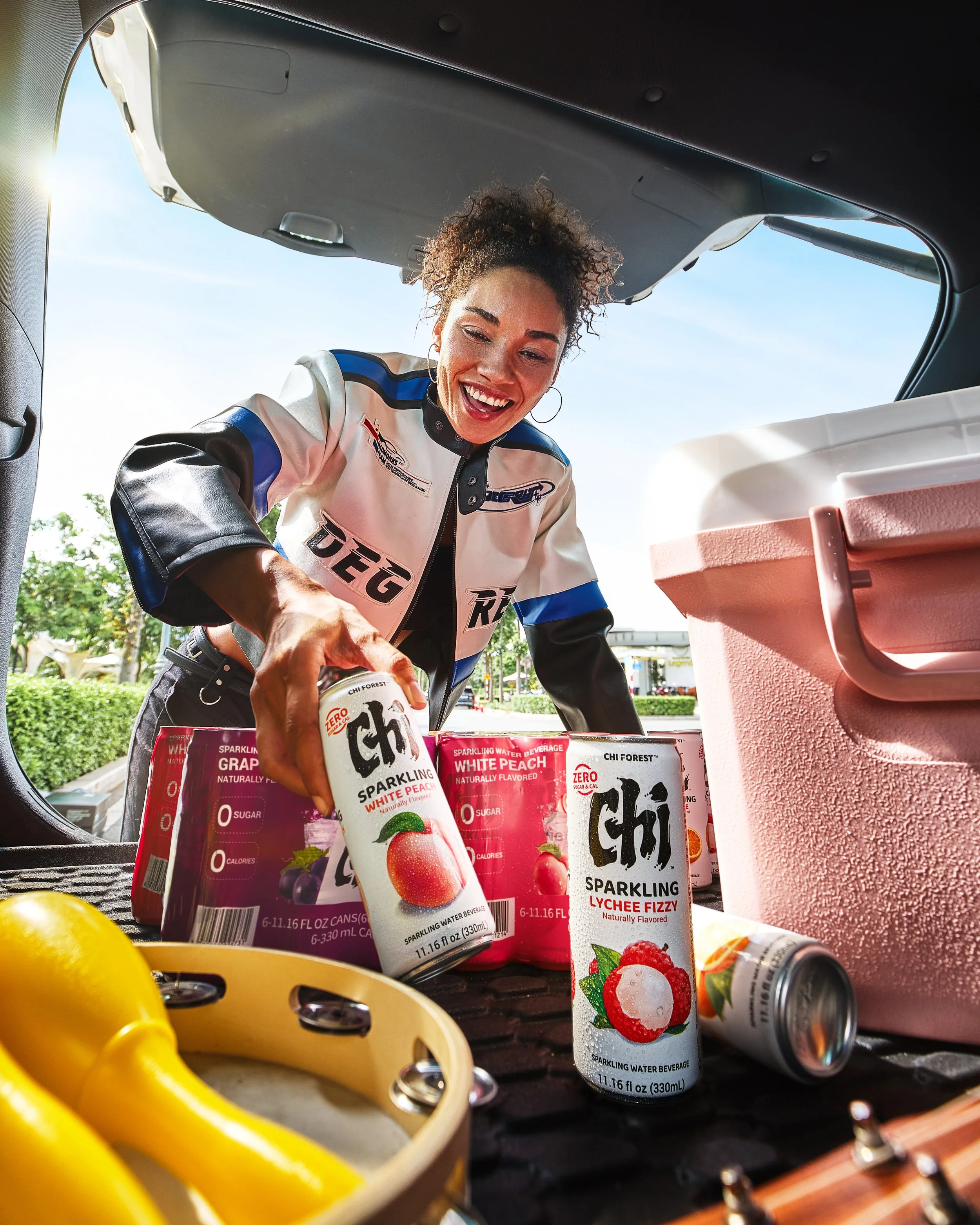
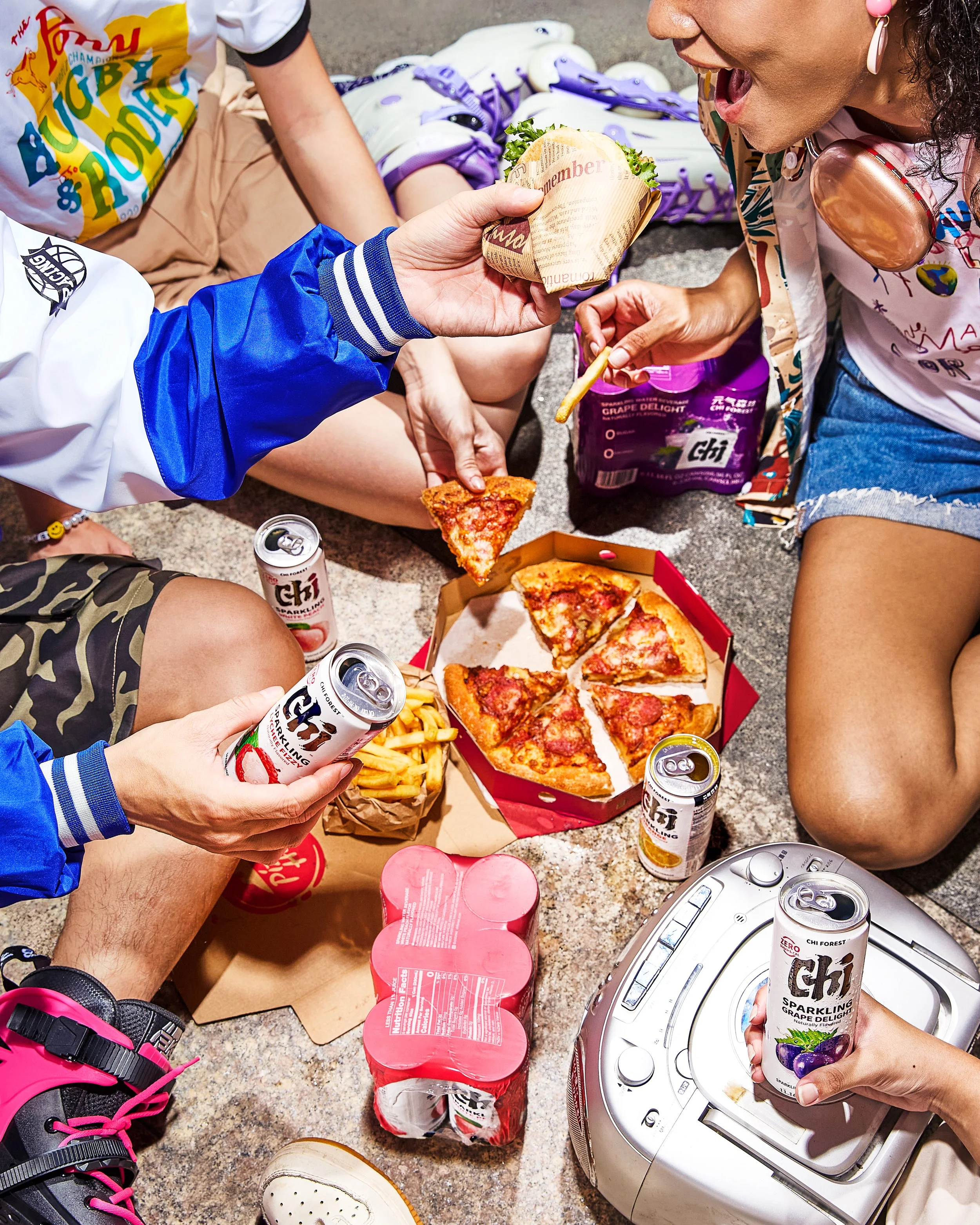
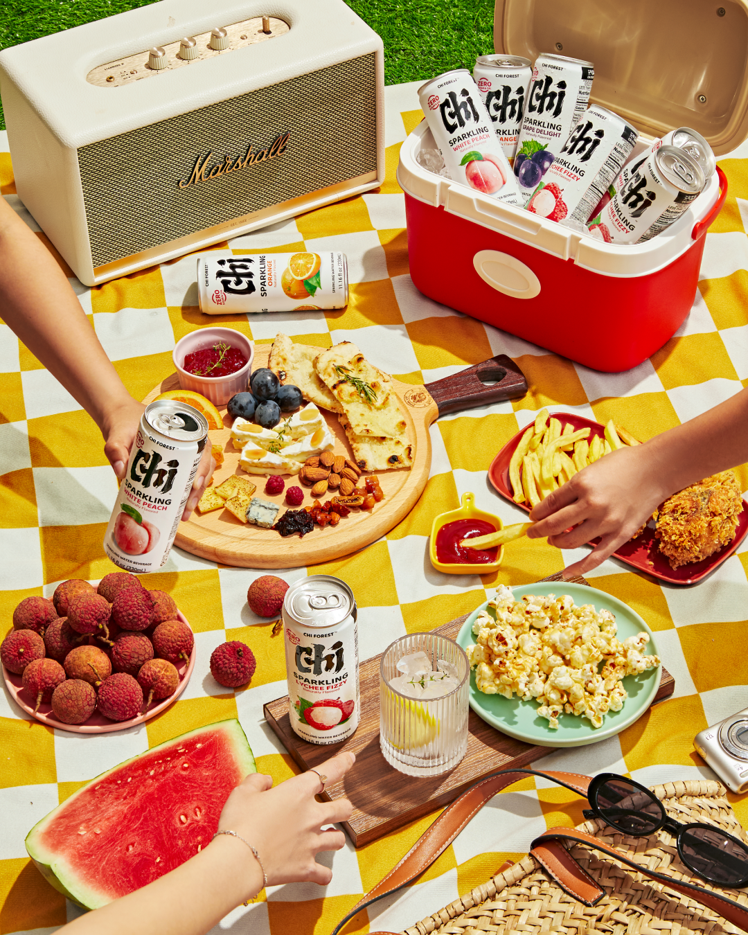
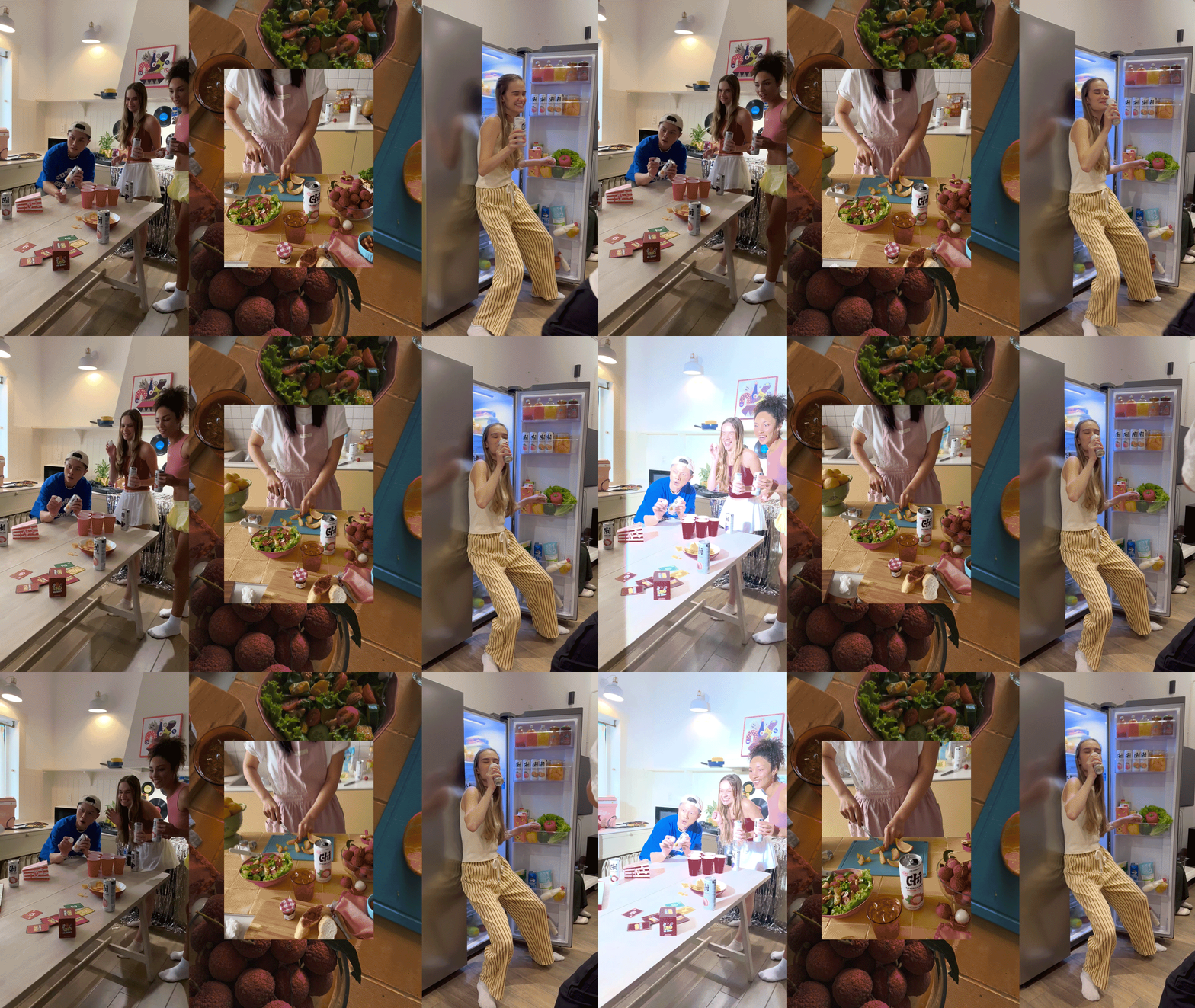
03 - Anytime, Anywhere:
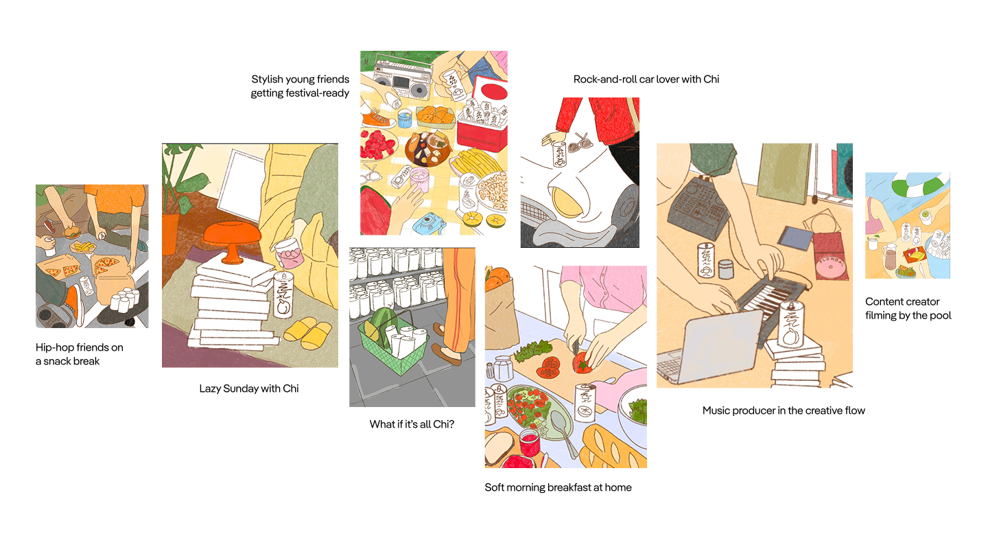
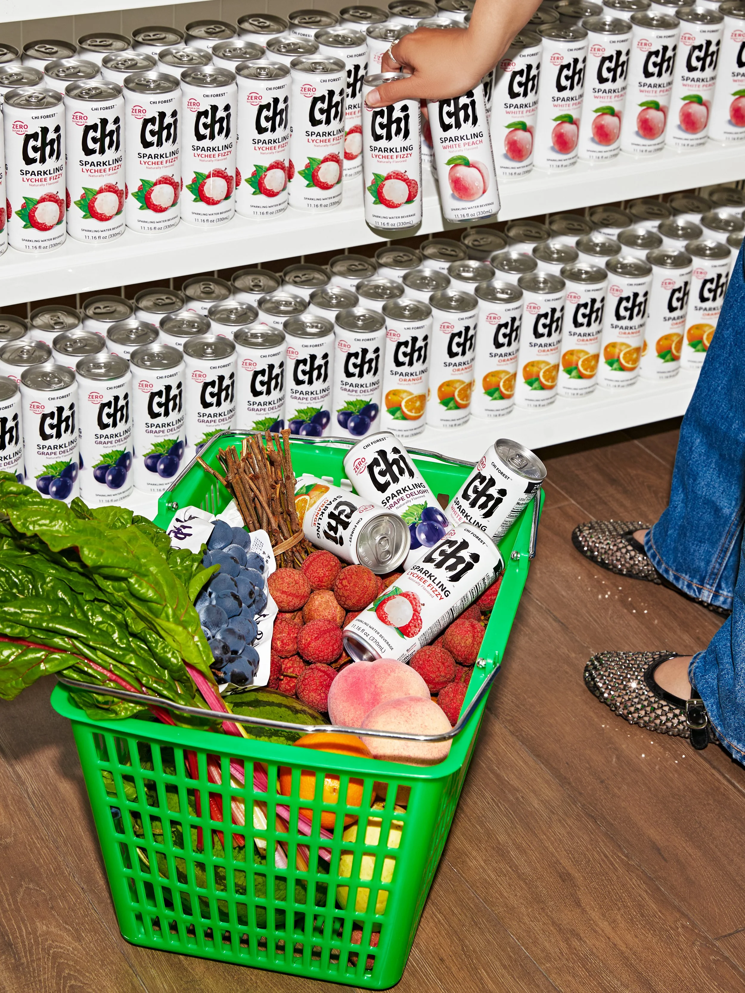
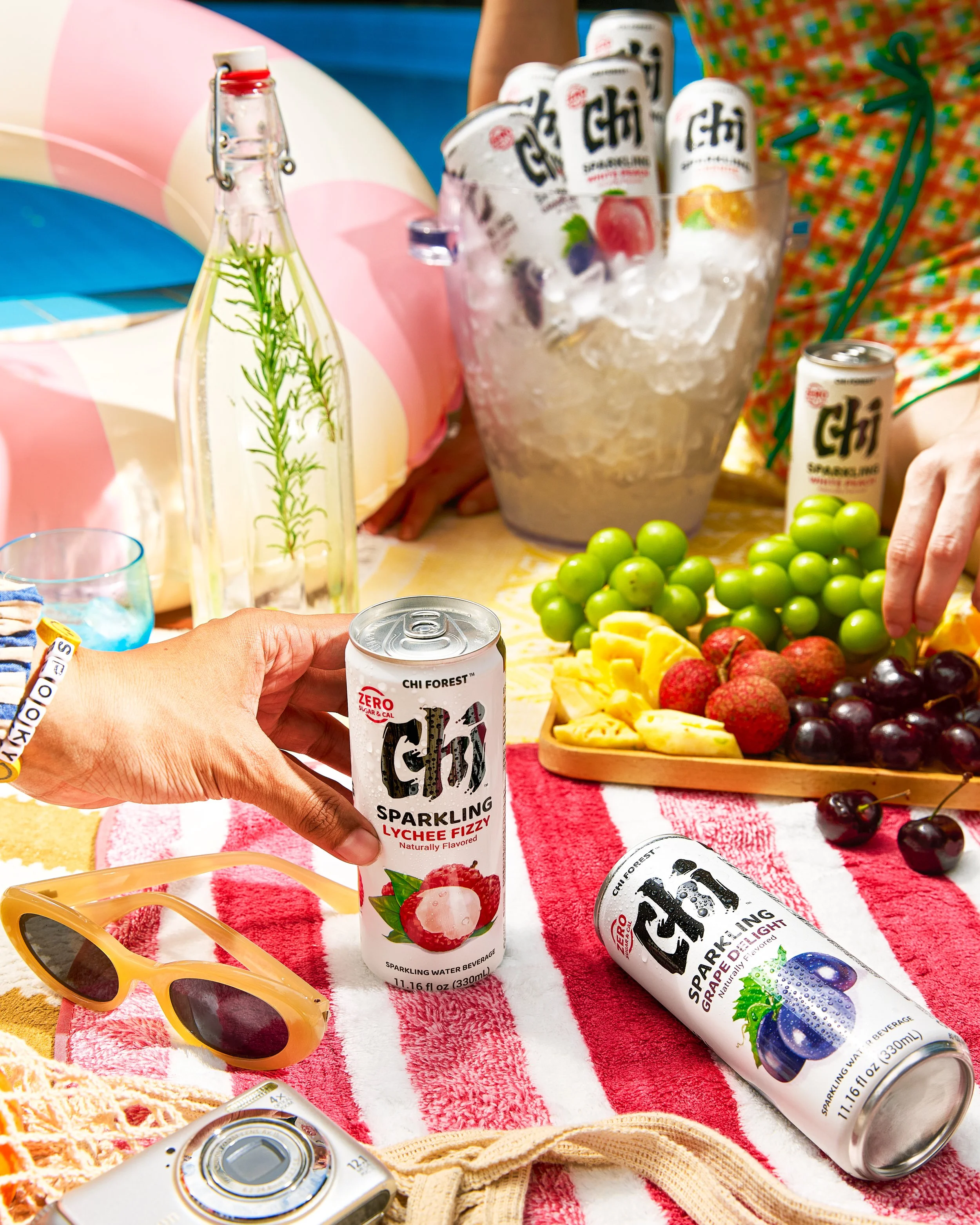
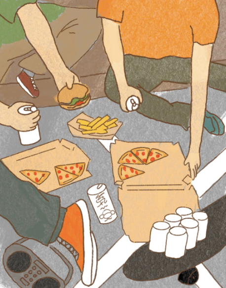
Chi Forest appearing naturally in everyday consumption contexts - at home, outdoors, and at the office.
VISUAL SYSTEM
Chi Forest's visual narrative is built across three layers.
Product Visual
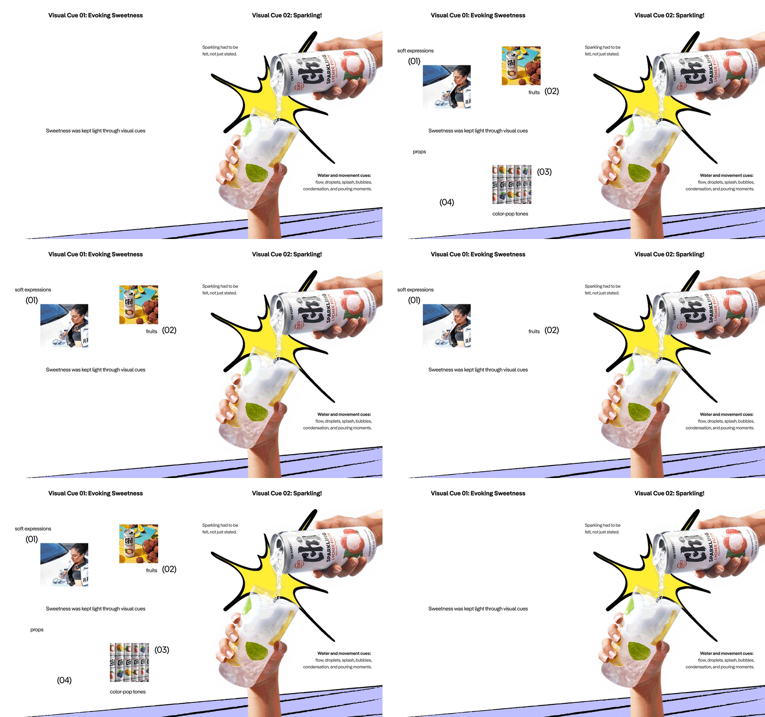
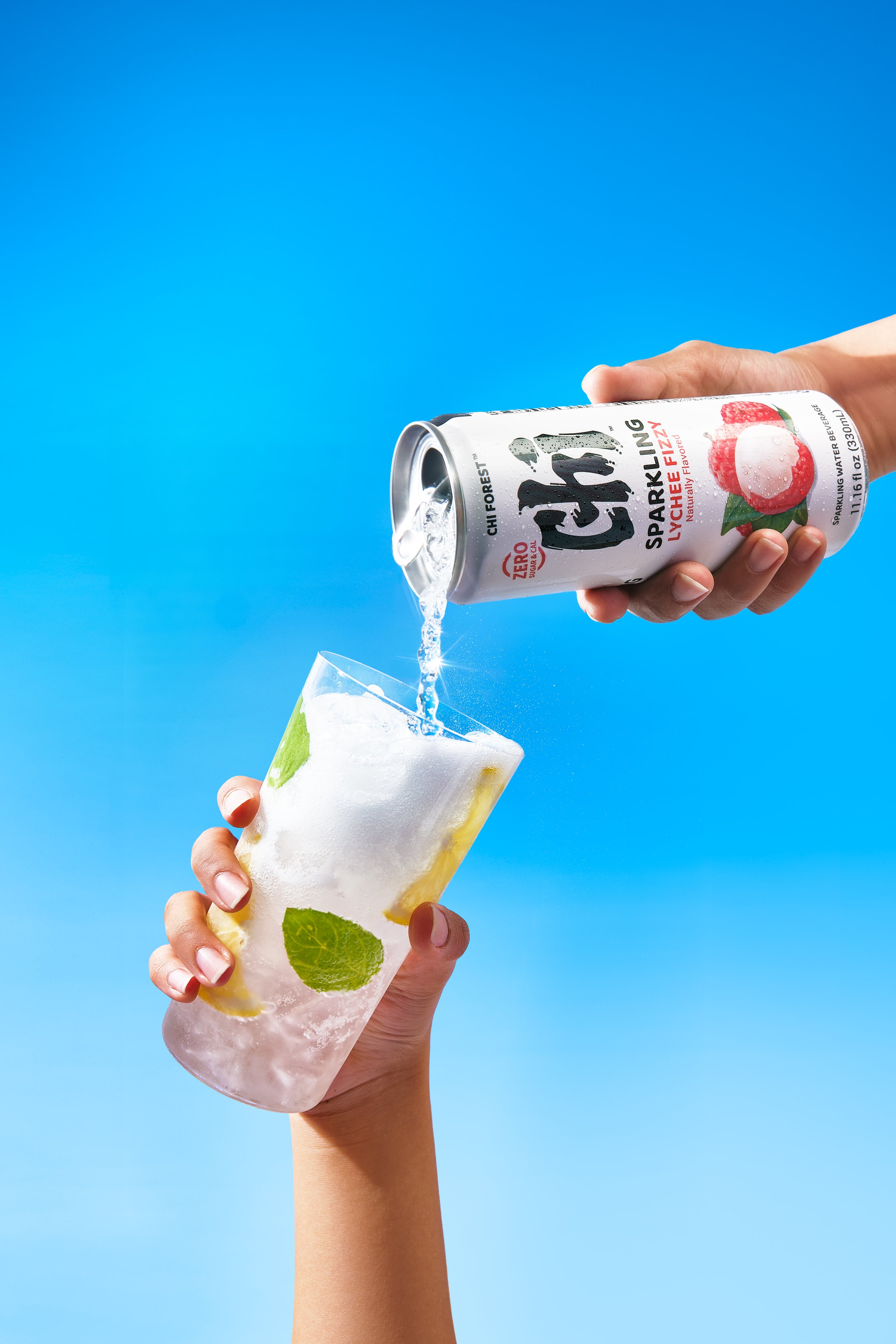
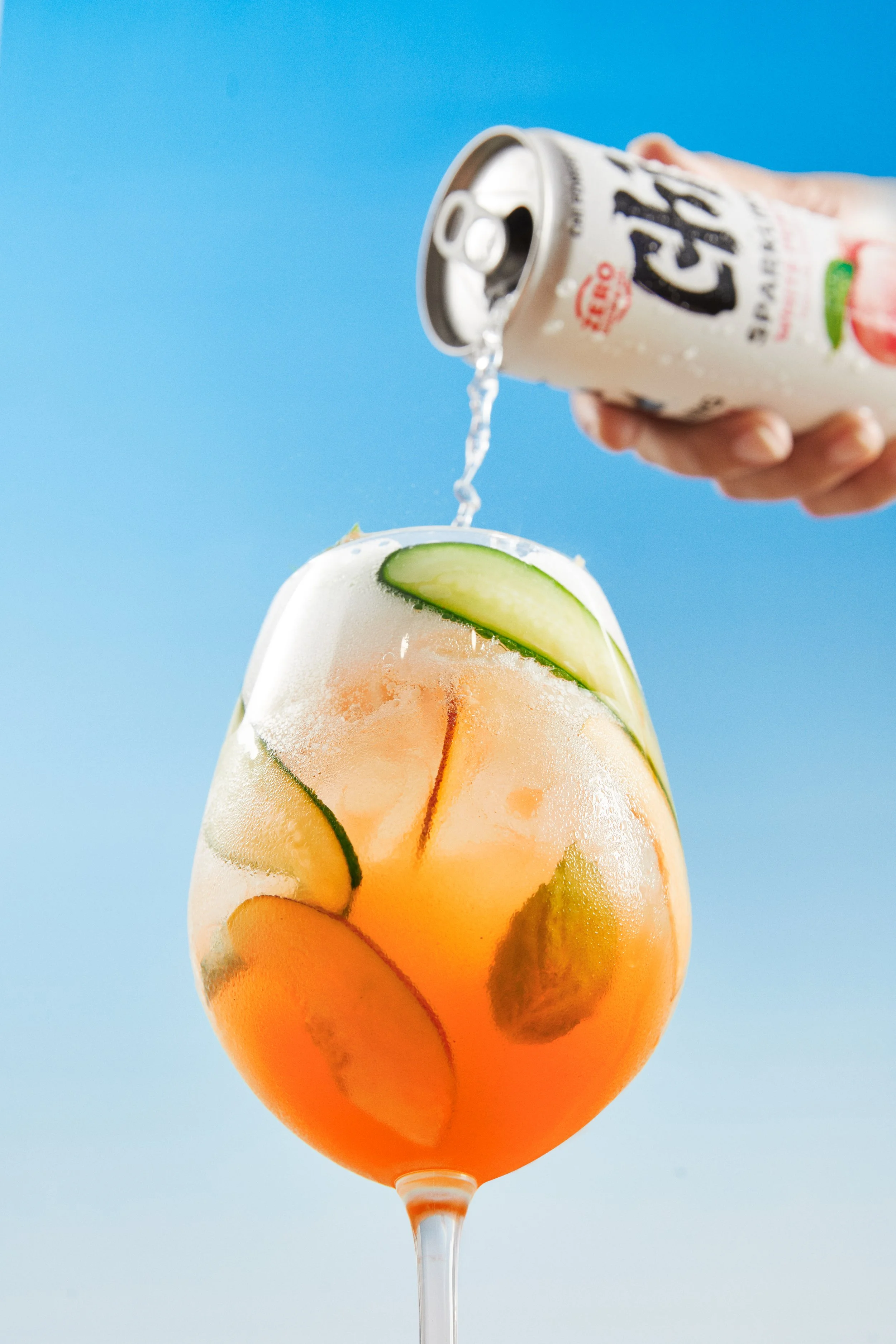
Highlighting the drink’s sparkling texture, chilled freshness, and Asian-inspired flavors through ingredients,
fruits, and pouring moments.
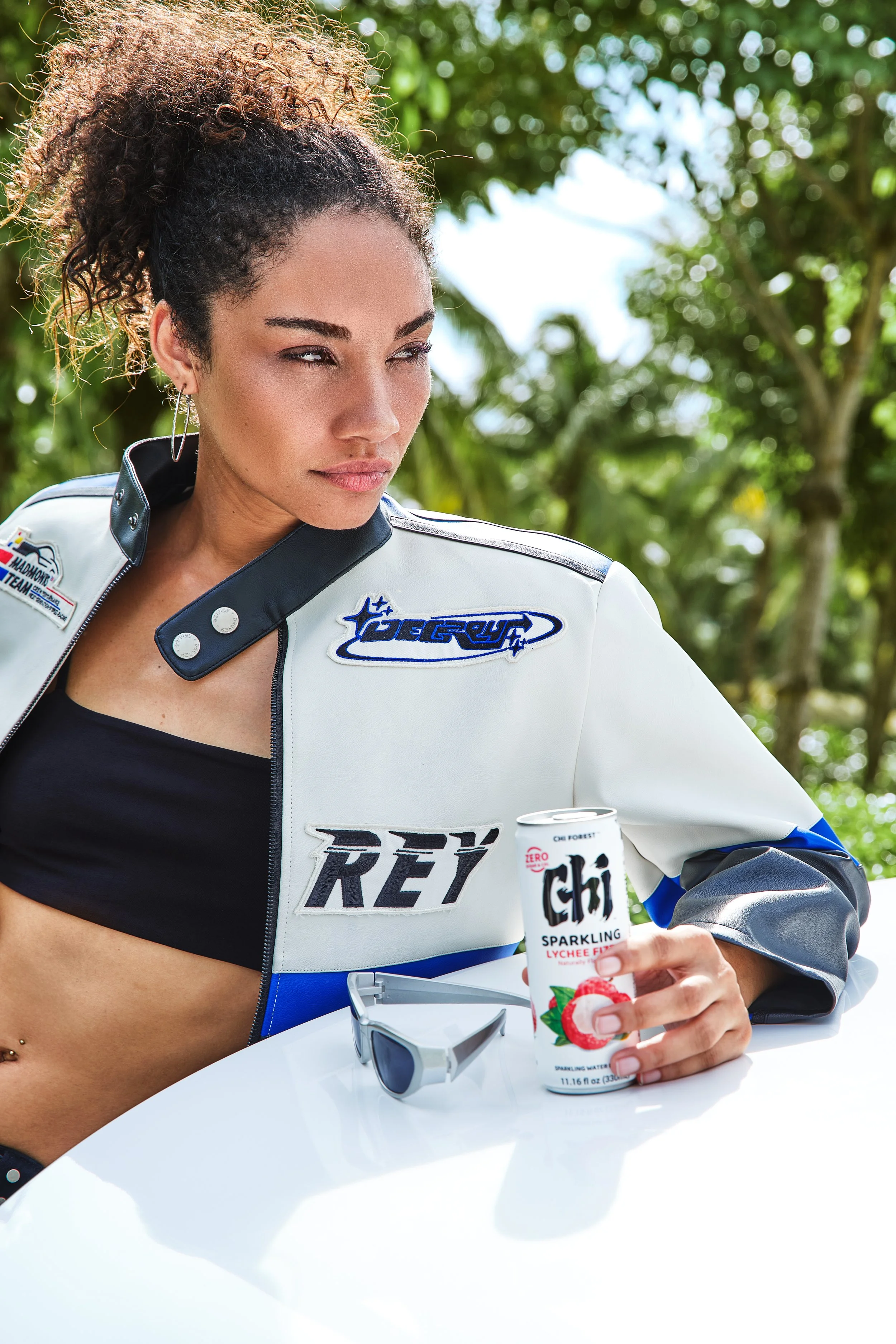
Lifestyle
Capturing diverse young people across different professions, ages, and personalities, enjoying Chi Forest in moments that feel free, natural, and balanced.
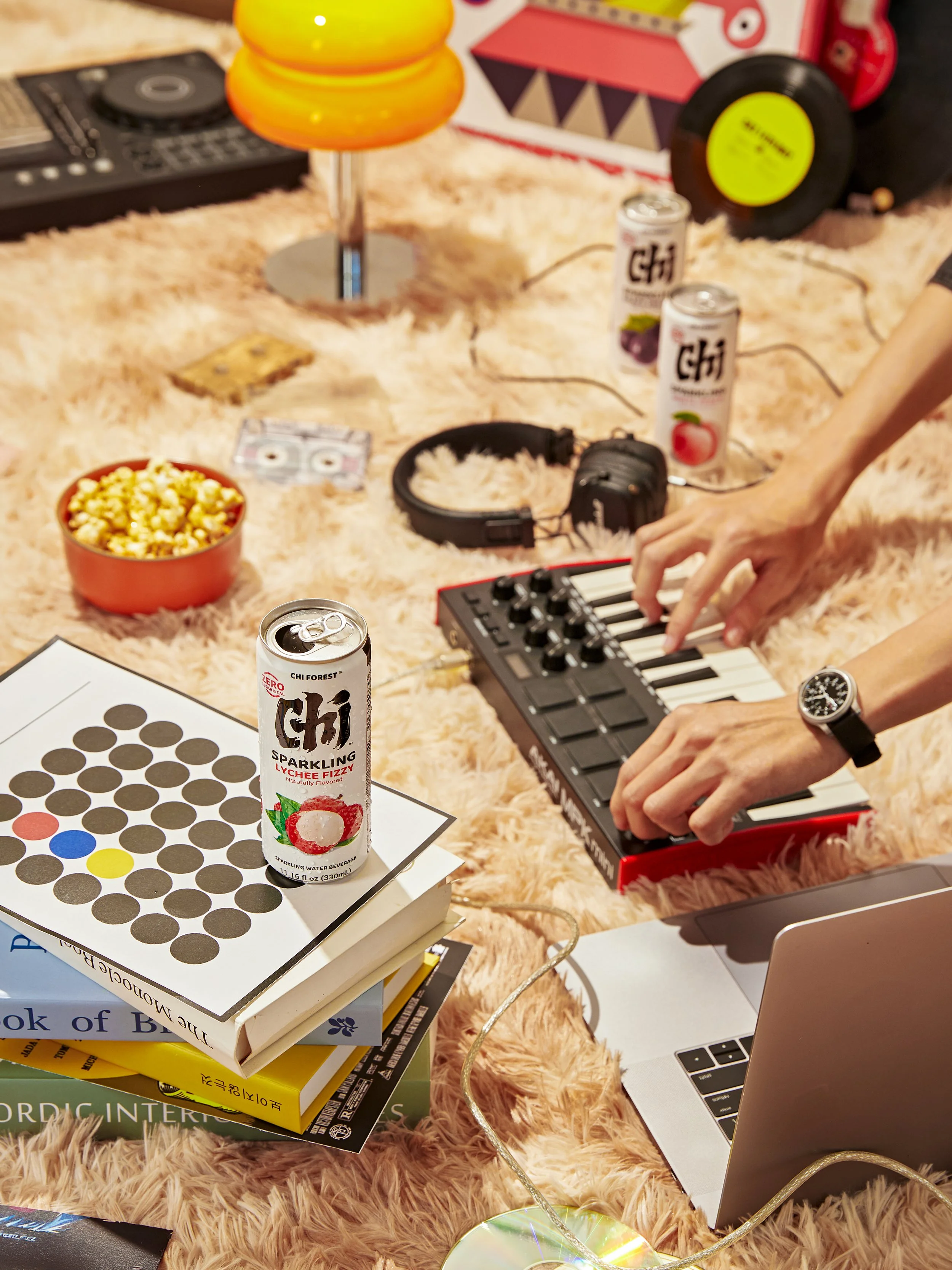
Editorial
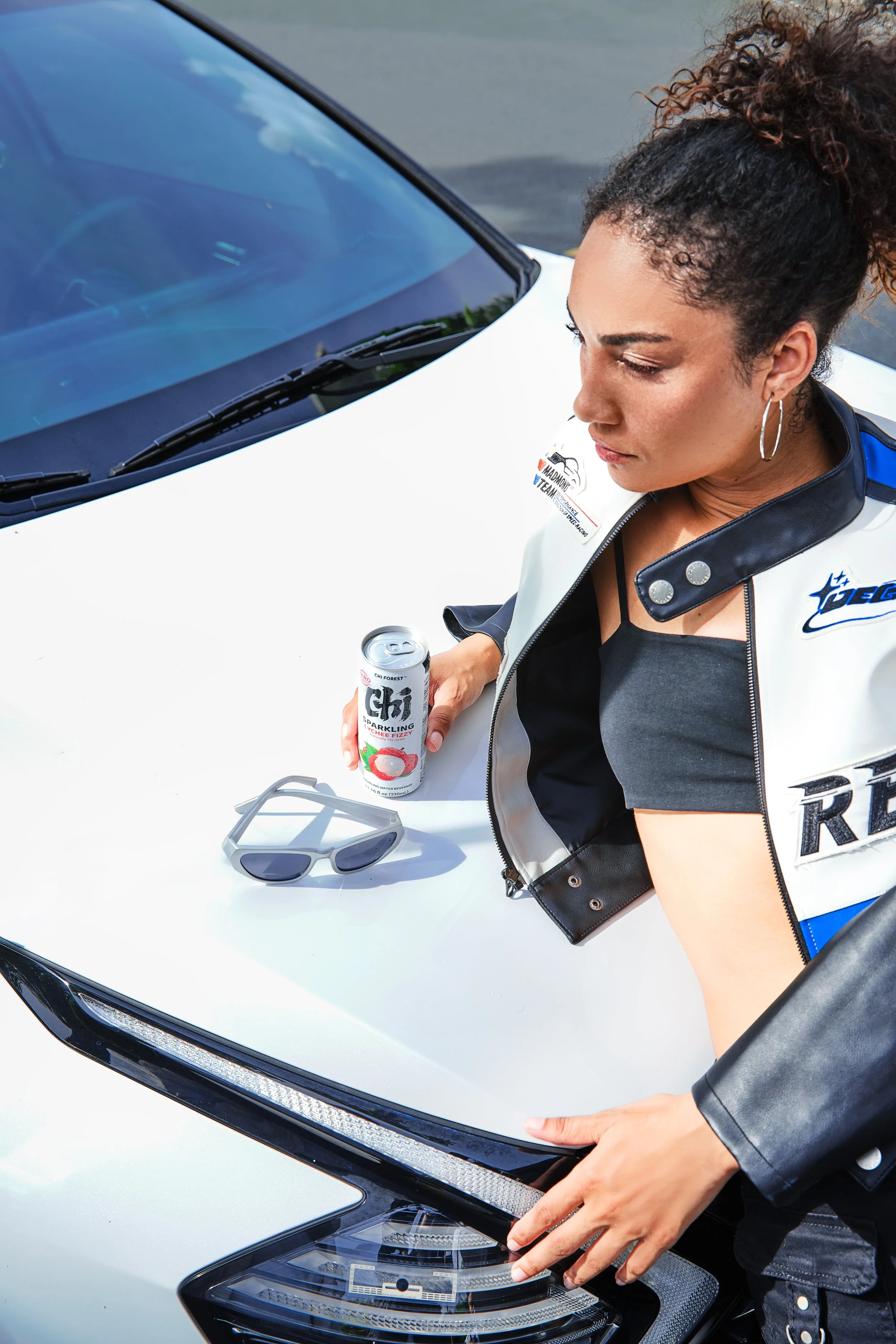
Bringing Asian-inspired flavor cues into more crafted compositions through ingredients, props, colors, and textures. Together these layers form a unified visual system where Chi Forest feels fresh, flavorful, expressive,
and naturally part of modern refresh moments.
Instagram Feed Strategy
-
Chi Forest’s Instagram direction balanced three content roles:
Lifestyle Moments: personality & relatability
Product & Ingredients: flavor recognition
Product in Context: everyday refresh moments.
Not just fresh. Built to feel more.
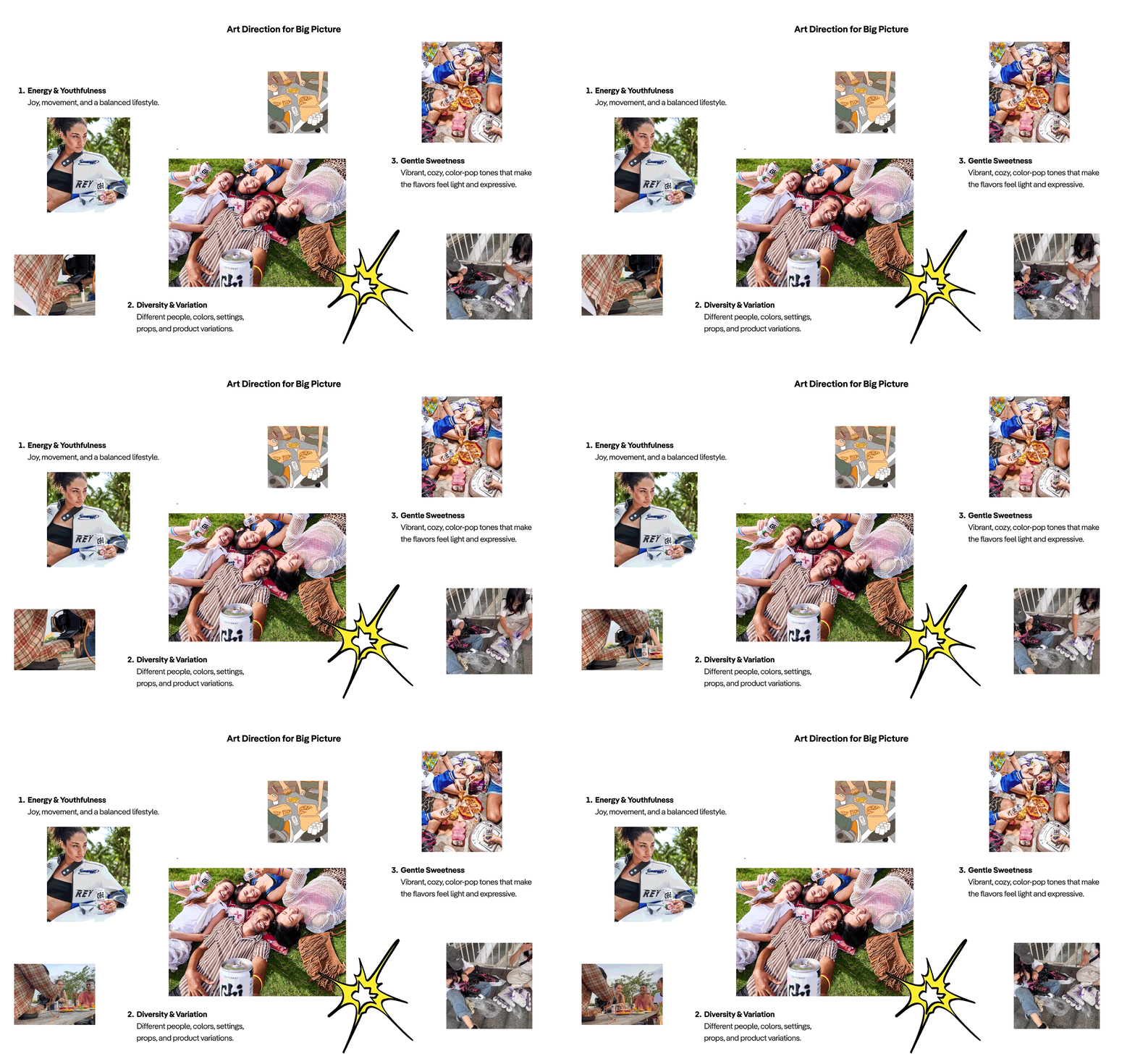
Through visual pillars, cues, art direction, feed rhythm, and typography, Chi Forest's visual system moved beyond a clean fresh impression,
becoming more sparkling, flavorful, expressive, and naturally part of modern refresh moments.
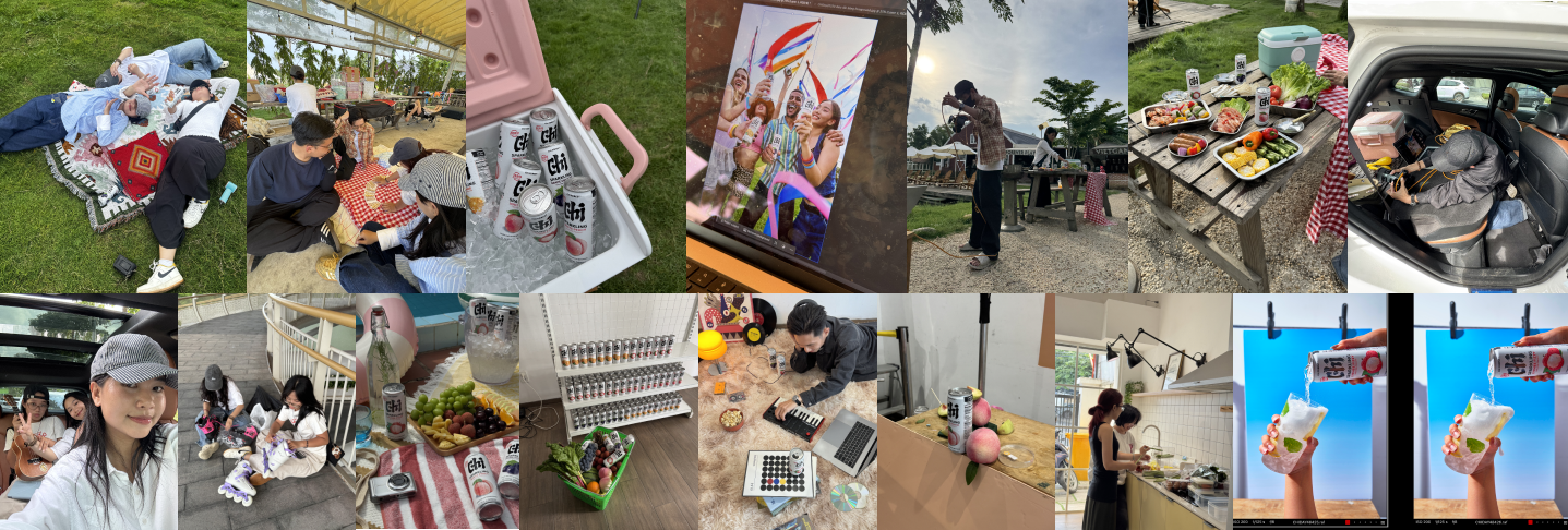
CREDIT
-
Brand: Chi Forest
Project: Chi Forest | Visual Branding Project
F&B Creative Studio: FPDB Creative
-
Creative Director: Đức Bùi
Project Manager: Khánh Ngọc
Account: Bảo Trâm, Huyền Linh
Producer: Quỳnh Anh & Ngọc Ánh
Art Director: Linh Tống
Art Director Assistant: Nhi Hoàng, Phương Hà, Thục Tuệ
Photographer: Đức Bùi, Đức Choco, Thoại Anh
Lighting: Gia Huy, Thắng Tom
Food Stylist: Nhi Nhí, Anh Đào
Props Master, Set Design: Minh Anh
PA: Phương Thảo, Thái Hà
Retoucher: Lê Nguyễn Nam
Stylist: Bửu Điền
Showcase Design: East.don
Showcase Copy: Diệu Thuỳ